Who can use it
Account Overview is available when:- Your account has 2 or more projects
- Your role grants the Access to analytics permission
How to open it
Click the project switcher in the top-left corner of the dashboard. At the bottom of the dropdown you’ll see an Account Overview button — click it to open the page. While you’re on Account Overview, the project switcher shows All projects instead of a single project name, and most sidebar items are disabled. To go back to a single project, pick it from the switcher.What’s on the page
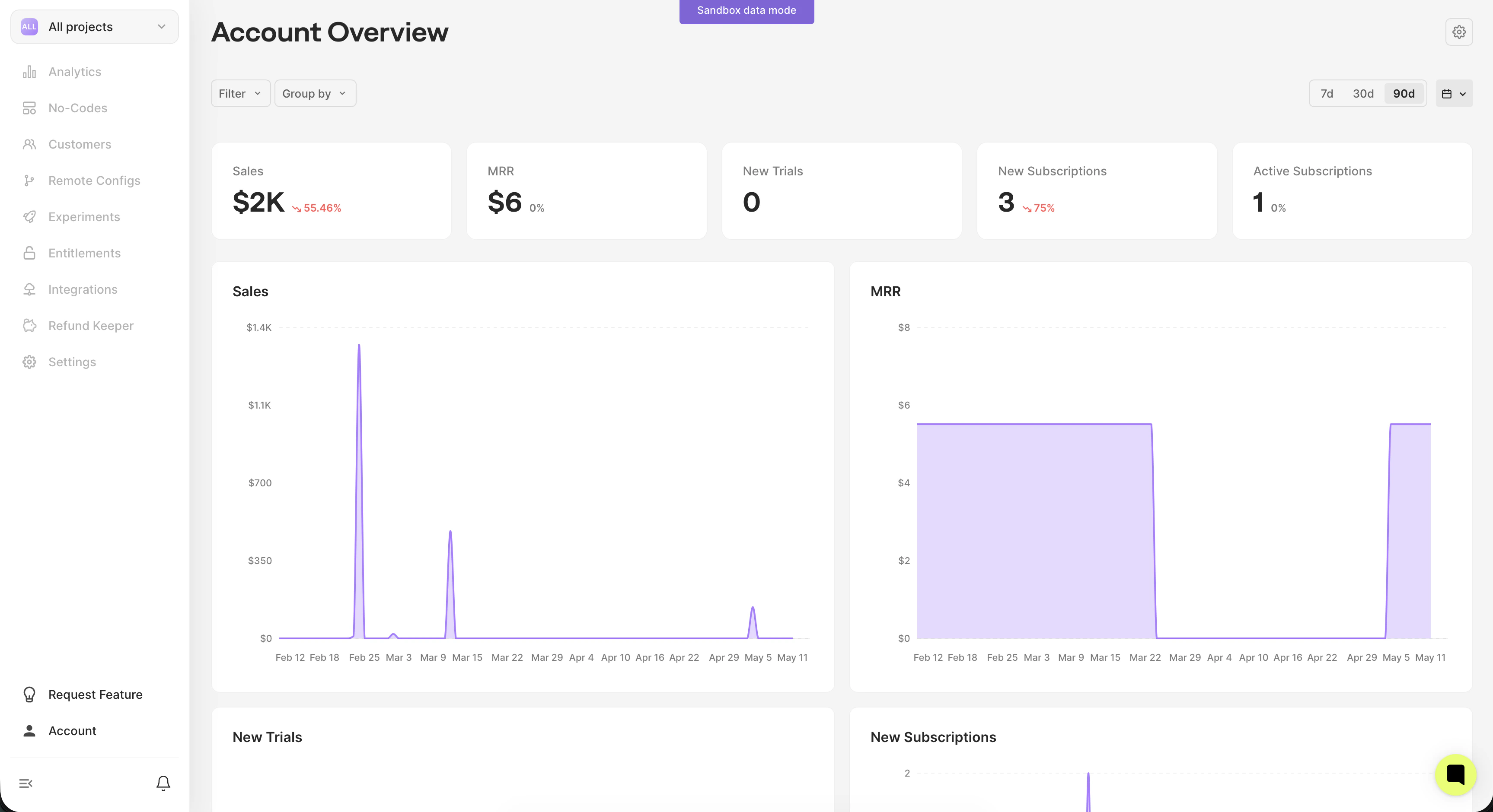
Top cards
Five summary cards show totals for the selected period across all your projects:- Sales — gross revenue from purchase events
- MRR — monthly recurring revenue (active regular subscriptions)
- New Trials — number of trials started
- New Subscriptions — number of subscriptions activated
- Active Subscriptions — number of currently active subscriptions
Charts
Six time-series charts mirror the cards plus New Users (clients created in the period). Hover any chart to see daily values; toggle the legend to focus on specific series.Breakdown table (Projects)
When you switch Group By away from “Total”, a per-project breakdown table appears below the charts. It lists each project with the same metrics, so you can spot which projects drive the totals. Click any row to drill into that project’s standard analytics.Filters and grouping
The toolbar above the cards offers two controls:Group by
Splits charts and the breakdown table by a dimension:- Total — single aggregated series (default)
- Project — one series per project
- Store, Country, Currency, Locale, Device, OS version, SDK version — split by client property
Filter
Narrows down the data without changing the grouping. Click Filter, pick a dimension (Store, Country, Device, etc.), then choose values. Multiple filters apply together (AND). Filter values are loaded from data observed across your projects, so what you see depends on what your apps report.Date range and currency
- Date range — the standard 7d / 30d / 90d / custom controls in the top-right. The previous period (used for the % change indicator) is the same length immediately before the selected range.
- Currency — change the display currency from the gear icon (top-right). All revenue values (Sales, MRR) are converted using daily exchange rates.
Tips
- Open one project quickly — click any row in the breakdown table to jump straight to that project’s monitoring dashboard.
- Keep your filters — date range, group-by, and value filters are preserved in the URL, so you can bookmark or share a specific view.
- Compare apps — pick “Group by Project” with a 30-day range to see which apps grew and which declined in the period.
- Check trial-to-paid health — combine New Trials and New Subscriptions charts; a widening gap may indicate trial conversion drops.