How It Works
Each component on your screen has style blocks (Typography, Size, Spacing, Background, etc.). You can attach conditional rules to any style block. Each rule contains:- Conditions — when should this rule apply (e.g., “Platform equals iOS AND Theme equals dark”)
- Style overrides — what properties to change when the conditions are met (e.g., set font-size to 24px and color to white)
Step-by-Step Example: Changing Typography for iOS Dark Mode
Let’s walk through a real example. We’ll change the title text style when the user is on iOS in dark mode — applying a different font, size, weight, and color to ensure the text looks great on dark backgrounds.1. Select the component
Click on the text component you want to add conditional logic to. In this example, we select a title text on the paywall screen.2. Open the Conditional Rules modal
In the right sidebar, find the Typography style block. Hover over the block header — a lightning bolt icon will appear. Click it to open the Conditional Rules modal.3. Add a new rule
Click Add Rule at the bottom of the modal. A new empty rule appears with a condition group and a style overrides section.4. Set the conditions
We need two conditions combined with AND logic: First condition:- Variable: select
Platformfrom the Device category - Operator: select
equals - Value: select
iOS
- Variable: select
Themefrom the Device category - Operator: select
equals - Value: select
dark
5. Set the style overrides
In the Overrides section below the conditions, configure the typography changes:
These values will override the component’s default typography when both conditions are met.
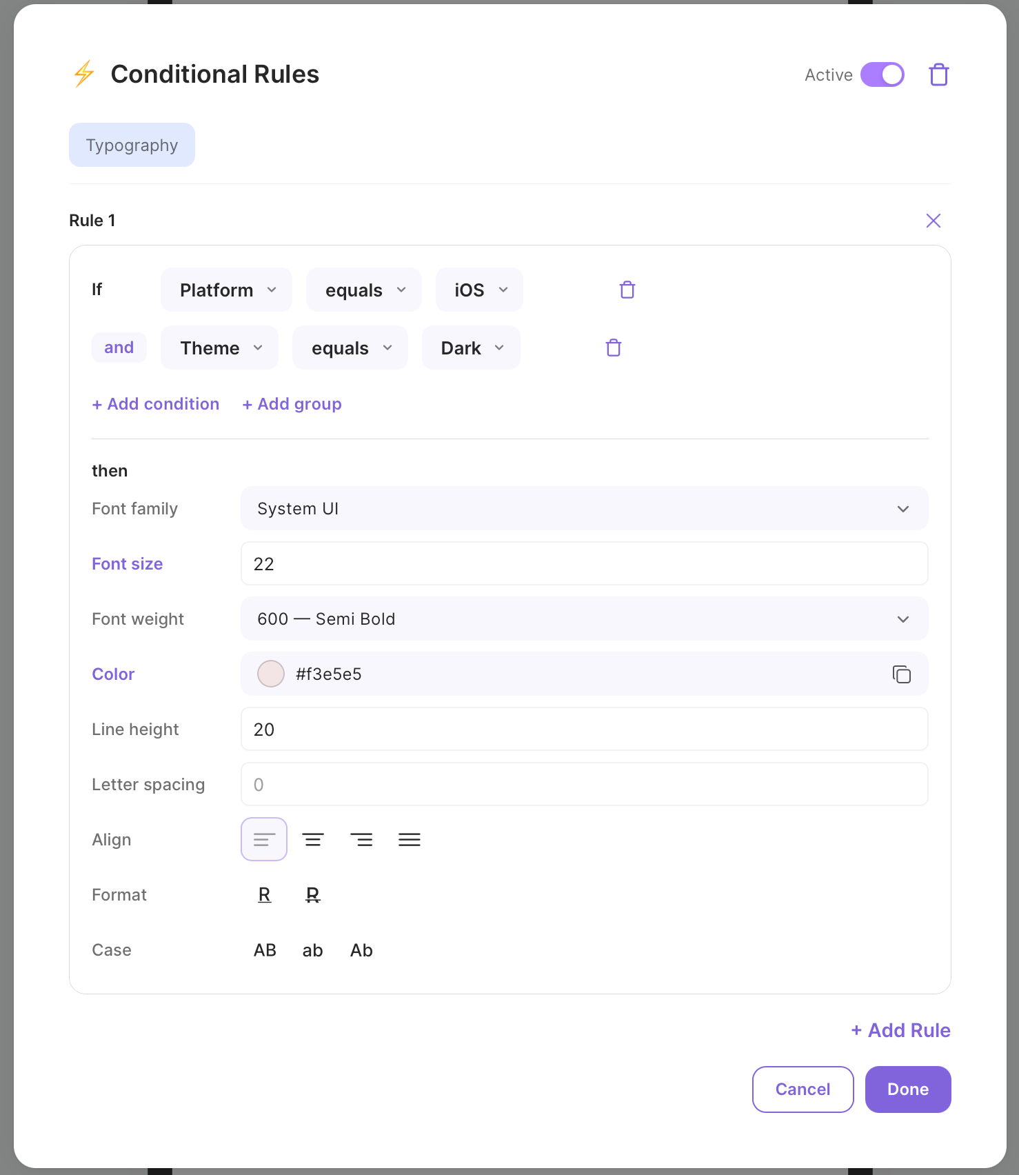
Conditional Rules modal — typography overrides for iOS dark mode
6. Save and preview
Click Apply to save the rules. The lightning bolt on the Typography block now shows a badge with the rule count. To test it, open the Preview Conditions Panel (the test tube icon in the header). You can manually change thePlatform and Theme variables to see how the component reacts in real time.
Conditions In Detail
Condition Groups: AND / OR
Conditions within a rule are organized in groups. Each group has a logical operator:- AND — all conditions in the group must be true
- OR — at least one condition must be true
and/or label between conditions to toggle the group operator.
Groups can be nested up to 2 levels deep, allowing complex expressions like:
Available Variables
Device
Products
Product variables are generated dynamically based on the products configured for your screen.
User
User Properties
User properties set via the Qonversion SDK (both defined and custom) are automatically available in the conditional logic context. They appear under theuser.properties namespace.
For example, if you set a custom user property plan with value premium, you can create a condition:
- Variable:
user.properties.plan - Operator:
equals - Value:
premium
User properties are loaded in parallel with other screen data, so they do not increase screen display time.
Custom Screen Variables
Custom screen variables are values you inject from your app code at runtime via theCustomVariablesDelegate. They are unique per screen (identified by contextKey) and are available for conditions under the custom variables namespace.
For example, if your delegate returns {"source": "settings"}, you can create a condition:
- Variable:
source(from Custom Variables category) - Operator:
equals - Value:
settings
Available Operators
Version comparisons (for OS Version and App Version) use semantic versioning — each segment is compared numerically. For example,
16.0 is greater than 9.3.6.Rule Priority
Rules are evaluated top to bottom within each style block. The first rule whose conditions evaluate totrue is applied — all subsequent rules are skipped.
This means you should order your rules from most specific to least specific:
Activating and Deactivating Rules
Each style block has an Active toggle in the Conditional Rules modal header. When toggled off:- All rules are preserved (not deleted)
- Rules are not evaluated at runtime
- The lightning bolt indicator remains visible but rules have no effect
Testing with Preview Panel
You don’t need to publish your screen to test conditional logic. The No-Code Builder has a built-in Preview Conditions Panel that lets you simulate any combination of variables and instantly see how your rules affect the screen — right inside the editor.How to open the panel
- Make sure you have at least one conditional rule configured on any component
- Switch to Preview mode using the toggle in the builder header
- The Preview Conditions Panel automatically appears on the left side of the screen
Testing variables
Each variable has an appropriate input control depending on its type:- Dropdowns — for variables with predefined values (Platform, Theme, Selected Product, Intro Type, etc.). Just pick a value from the list
- Checkboxes — for boolean variables (Has Any Intro, Has Any Entitlement, Is First Launch, etc.). Toggle on or off
- Text inputs — for string and version variables (OS Version, Language, App Version, Country, etc.). Type any value to simulate
- Number inputs — for numeric variables (Days Since Install, etc.)
Active Rules
The bottom section of the panel shows Active Rules — a live list of which rules are currently matching based on the current variable values. This makes it easy to verify that the right rules fire for the right conditions.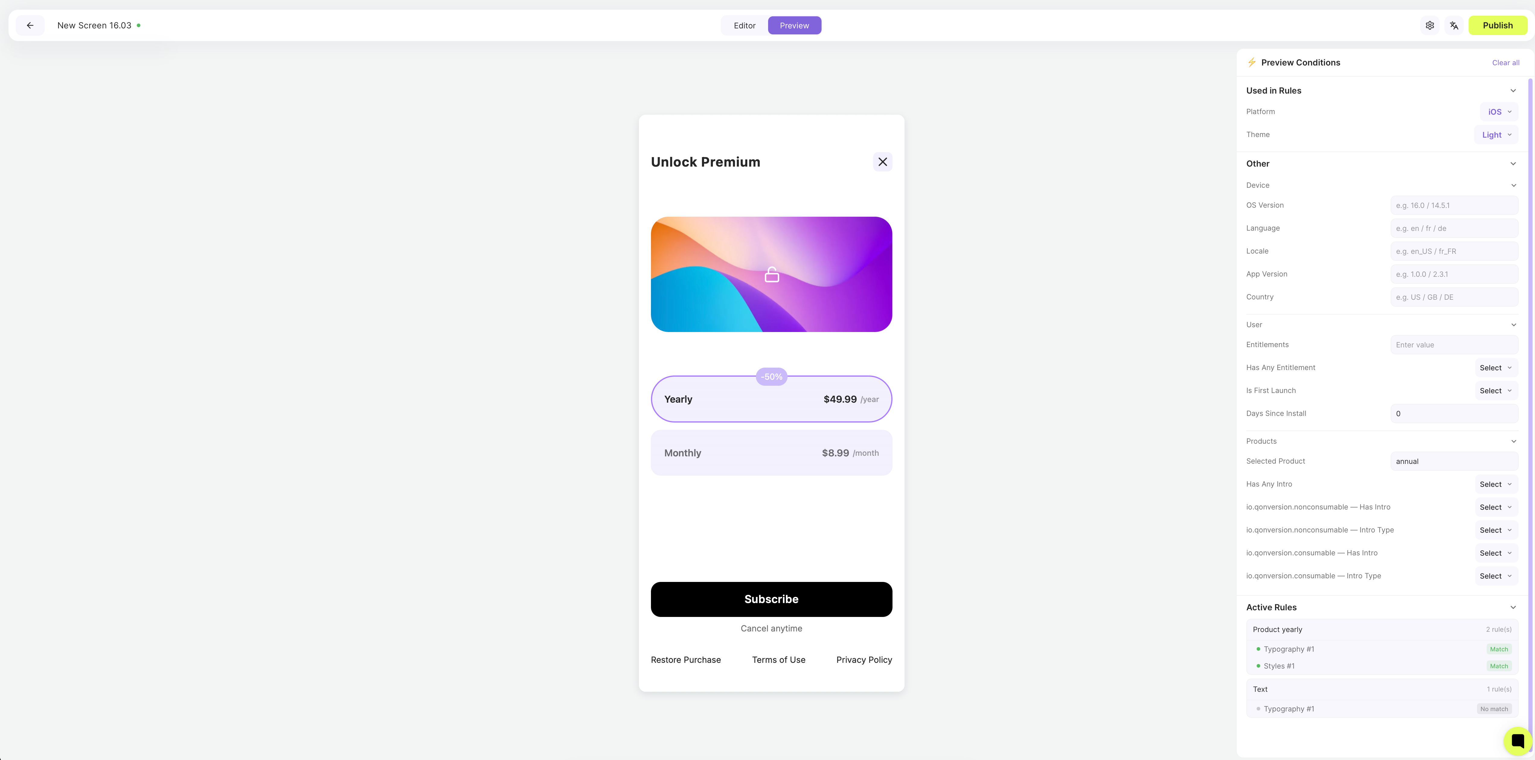
Preview Conditions Panel — test variables and see active rules in real time
Common Use Cases
Highlight the selected product
Condition: Selected Product equals the product ID Typography override: Bold font weight, accent color Use case: Make the currently selected product’s title or price stand out visually.Platform-specific layout
Condition: Platform equalsiOS / Android
Spacing or Size override: Adjust padding, margins, or dimensions
Use case: Account for platform-specific UI conventions (e.g., larger touch targets on Android).
Dark mode support
Condition: Theme equalsdark
Typography + Background + Border override: Light text on dark background, adjusted border colors
Use case: Ensure your paywall looks great in both light and dark themes.
Show/hide elements by entitlements
Condition: Has Any Entitlement equalstrue
Appearance override: Visibility hidden
Use case: Hide the purchase button for users who already have an active subscription.
Free trial badge
Condition: Product Has Intro equalstrue AND Intro Type equals free_trial
Appearance + Typography override: Show a badge, change text color
Use case: Visually indicate which products offer a free trial.
First-time user experience
Condition: Is First Launch equalstrue
Any style override: Different layout, larger text, highlighted CTA
Use case: Show a more prominent onboarding experience for first-time users.
Personalization with custom variables
Condition: Custom variableplan equals free
Typography + Appearance override: Show upgrade messaging, accent CTA color
Use case: Display a prominent upgrade prompt for free-tier users while hiding it for premium subscribers. Variables are injected via CustomVariablesDelegate.
Context-aware styling with user properties
Condition:user.properties.loyalty_tier equals gold
Background + Typography override: Gold accent color, exclusive badge visibility
Use case: Show VIP styling and exclusive offers to high-value users based on properties already tracked via the Qonversion SDK.
Setting Up Custom Variables
Custom screen variables let you pass dynamic data from your app into the No-Code screen context at runtime. This is useful for conditions that depend on app-specific state — such as the screen the user came from, their subscription tier, or feature flags. You provide variables by implementing a delegate that the SDK calls each time a screen is ready to display. The delegate receives acontextKey identifying the screen and returns a dictionary of string key-value pairs. Different screens can receive different variables.
Implementation
Setting the delegate
You can set the delegate during initialization or at runtime:The delegate is called every time a screen is about to be shown, including nested screens during navigation within a NoCodes flow. Use the
contextKey parameter to return different variables for different screens.How it works
When the screen is ready to display, the SDK:- Calls your delegate with the screen’s
contextKey - Injects each returned key-value pair into the WebView JavaScript context via
window.noCodesSetVariable(name, value) - The conditional logic evaluator uses these variables when checking rules
Use cases for custom variables
SDK Requirements
Conditional logic requires the following minimum SDK versions:
The SDK provides runtime context to the paywall via the
setContext event. If the SDK version is too old, conditional logic rules will still be present in the published HTML but the context will be empty — meaning no rules will match and default styles will be shown.
Custom Variables and User Properties in the NoCodes context are currently available on iOS and Android native SDKs. Cross-platform SDK support will be added in future releases.
Limitations
- Conditional logic is available for Mobile Paywall and Mobile Onboarding screen types only
- Condition groups can be nested up to 2 levels deep
- Each group supports up to 10 conditions
- A soft warning appears when a style block has 20+ rules (no hard limit)
- Rules are evaluated client-side in the published HTML — complex rule sets may have a minor performance impact
- Custom variables from the delegate are string-only (
[String: String]) — use string comparison operators in conditions - Custom variables are injected per screen show — they are not persisted across sessions
- User properties must be set via the Qonversion SDK before the screen is shown to be available in conditions