> ## Documentation Index
> Fetch the complete documentation index at: https://documentation.qonversion.io/llms.txt
> Use this file to discover all available pages before exploring further.
# Creating Screens
> Once your store connection and SDK setup are complete, you can start designing your first screen inside the Builder. Each screen is made of modular components that you can arrange, style, and connect to your products — visually, with no code.
Once your SDK is [installed](installation) and initialized, you can start building your first in-app screen directly from the Qonversion dashboard.
No builds. No releases. Everything happens visually — right inside your browser.
***
## Accessing the Builder in Dashboard
1. Open your project in the Qonversion **Dashboard**.
2. Navigate to the **No-Code Builder** section in the left sidebar.
3. Click **Create New Screen** to begin.
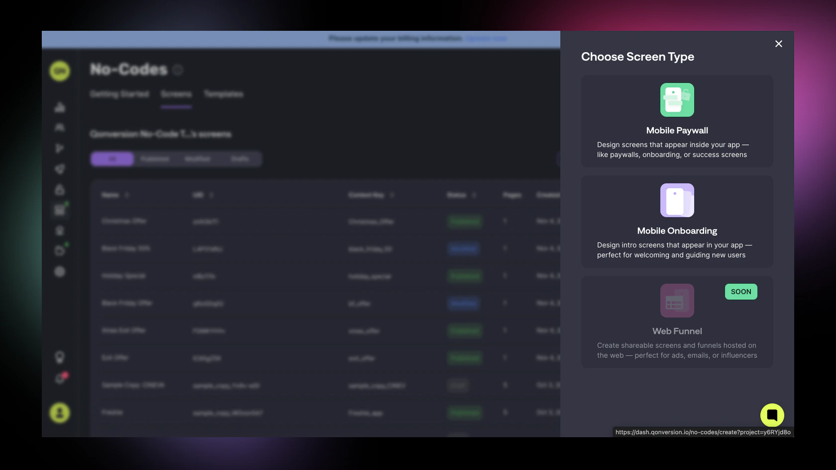
You’ll first choose what type of screen you want to create:
* **Mobile Paywall** – single-page layout for offers or subscriptions.
* **Mobile Onboarding** – multi-page layout for tutorials or funnels.
Once selected, you can start from a **template** or design from **scratch**.
 ***
## Overview of the Interface
The Builder interface is designed to feel familiar to both designers and developers — a simple layout with real-time preview and drag-and-drop control.
### Canvas & Settings
The main working area where your screen layout lives. You can add, move, and resize components directly on the canvas and see updates instantly.
***
## Overview of the Interface
The Builder interface is designed to feel familiar to both designers and developers — a simple layout with real-time preview and drag-and-drop control.
### Canvas & Settings
The main working area where your screen layout lives. You can add, move, and resize components directly on the canvas and see updates instantly.
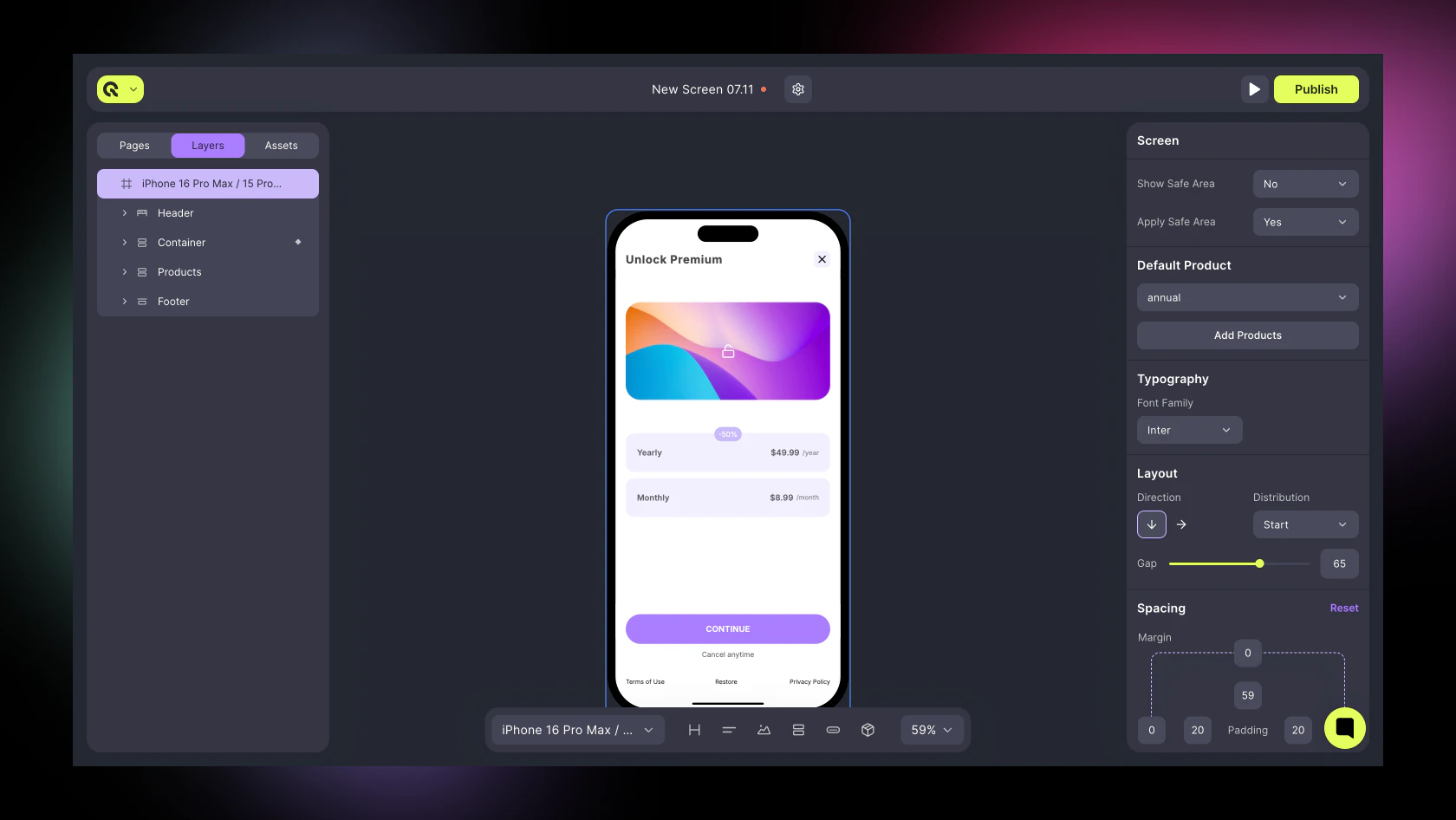 The Canvas is your adaptive artboard — where your entire screen layout lives.
Before adding components, it’s important to configure your **Canvas Settings,** as these define how your design behaves and looks across devices.
* Set your Default Product (if applicable).
* Choose your Font Family and Layout Direction.
* Enable Safe Area to automatically apply 20 px horizontal and 59 / 34 px vertical padding.
You can access **Canvas Settings** from the **Right Panel** when **Canvas Layer** is Selected.
**Canvas settings** act as the foundation of your design. They define global appearance and structure before you start adding components.
***
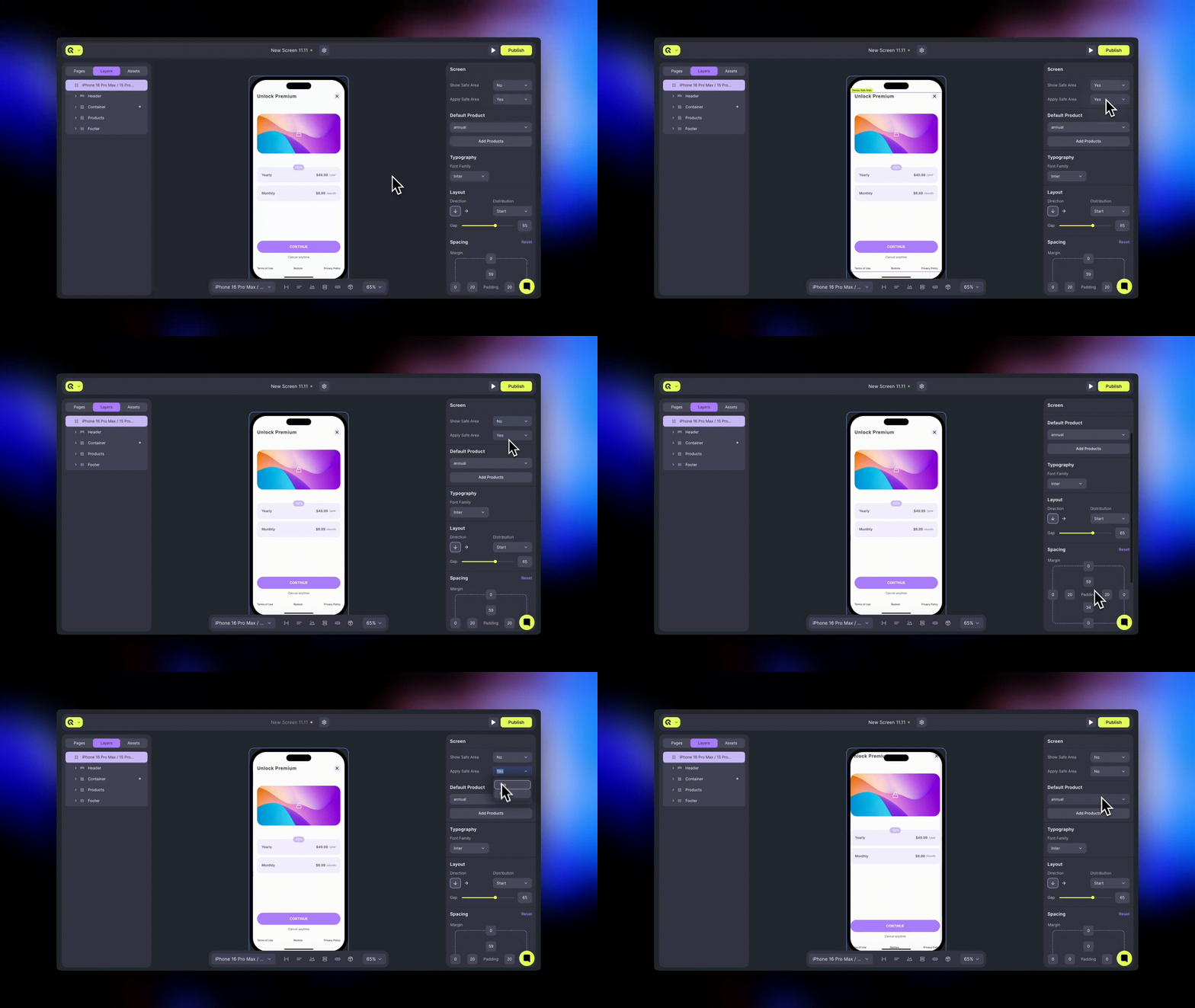
#### Screen & Safe Area
Tip: Keep “**Apply Safe Area**” enabled to prevent overlapping with system UI elements
| Setting | Description |
| ------------------- | --------------------------------------------------------------------------------------------------------------------------------------------------------------------------------------------------------------------------------------- |
| **Show Safe Area** | Toggles visible device margins on or off to help align elements. |
| **Apply Safe Area** | Automatically applies platform-specific insets to keep your content within safe boundaries (e.g., notch, home indicator). When enabled, it adds: • 20 px horizontal padding (left and right) • 59 px top padding • 34 px bottom padding |
The Canvas is your adaptive artboard — where your entire screen layout lives.
Before adding components, it’s important to configure your **Canvas Settings,** as these define how your design behaves and looks across devices.
* Set your Default Product (if applicable).
* Choose your Font Family and Layout Direction.
* Enable Safe Area to automatically apply 20 px horizontal and 59 / 34 px vertical padding.
You can access **Canvas Settings** from the **Right Panel** when **Canvas Layer** is Selected.
**Canvas settings** act as the foundation of your design. They define global appearance and structure before you start adding components.
***
#### Screen & Safe Area
Tip: Keep “**Apply Safe Area**” enabled to prevent overlapping with system UI elements
| Setting | Description |
| ------------------- | --------------------------------------------------------------------------------------------------------------------------------------------------------------------------------------------------------------------------------------- |
| **Show Safe Area** | Toggles visible device margins on or off to help align elements. |
| **Apply Safe Area** | Automatically applies platform-specific insets to keep your content within safe boundaries (e.g., notch, home indicator). When enabled, it adds: • 20 px horizontal padding (left and right) • 59 px top padding • 34 px bottom padding |
 ***
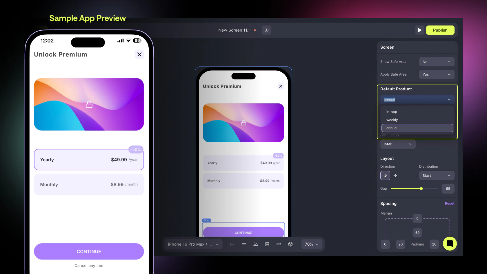
#### Default Product
If your screen includes purchase options, set a **Default Product** here. This determines which product is **pre-selected when the screen loads** — for example, your most popular subscription plan.
| Setting | Description |
| ------------------- | ------------------------------------------------------------------------------------------------------ |
| **Default Product** | Select one of your existing products to pre-select on screen load |
| **Add Products** | Opens the product linking modal where you can connect or create new products directly from the Builder |
***
#### Default Product
If your screen includes purchase options, set a **Default Product** here. This determines which product is **pre-selected when the screen loads** — for example, your most popular subscription plan.
| Setting | Description |
| ------------------- | ------------------------------------------------------------------------------------------------------ |
| **Default Product** | Select one of your existing products to pre-select on screen load |
| **Add Products** | Opens the product linking modal where you can connect or create new products directly from the Builder |
 ***
#### Typography
Choose a global Font Family to apply across all text components on the screen. Individual components can override this setting later.
| Setting | Description |
| --------------- | --------------------------------------------------------------------------------------------- |
| **Font Family** | Defines the base typeface used by all text elements. Supports 20 + system and web-safe fonts. |
***
#### Layout
Controls how elements are positioned and spaced within the screen. This setting determines stacking direction, alignment, and gaps between child components.
| Setting | Description |
| ---------------- | ----------------------------------------------------------------------------------------------------------------- |
| **Direction** | Defines the layout flow — **Vertical (↓)** for stacked components or **Horizontal (→)** for side-by-side layouts. |
| **Distribution** | Sets how elements align within the available space (Start, Center, End, or Space Between). |
| **Gap** | Controls equal spacing between immediate child components. |
For most paywalls, use **Vertical** Direction → **Space Between** Distribution. **Space Between** Setting disables **Gap** Setting
***
#### Spacing
Fine-tune how your Canvas interacts with the overall screen space.
| Setting | Description |
| ----------- | --------------------------------------------------------------------------------------------------------------------------------------------------------- |
| **Margin** | Adds space outside your Canvas (rarely used). |
| **Padding** | Adds internal space within your Canvas. When **Safe Area** is applied, padding values default to **Top 59 px**, **Bottom 34 px**, **Left / Right 20 px**. |
These values ensure that essential content is always visible on all modern device screens.
***
#### Background
Apply a base background to your screen — solid color, gradient, or image.
| Setting | Description |
| ------------------ | ----------------------------------------------------------------- |
| **Add Background** | Opens the background picker for color, gradient, or image upload. |
Use solid backgrounds for paywalls, or gradients/images for onboarding and promotional flows.
### Left Sidebar
The **Left Sidebar** is your main navigation panel inside the Builder. It helps you manage your project’s structure, screens, and all components.
It includes three tabs: **Pages**, **Layers**, and **Assets**.
***
#### Typography
Choose a global Font Family to apply across all text components on the screen. Individual components can override this setting later.
| Setting | Description |
| --------------- | --------------------------------------------------------------------------------------------- |
| **Font Family** | Defines the base typeface used by all text elements. Supports 20 + system and web-safe fonts. |
***
#### Layout
Controls how elements are positioned and spaced within the screen. This setting determines stacking direction, alignment, and gaps between child components.
| Setting | Description |
| ---------------- | ----------------------------------------------------------------------------------------------------------------- |
| **Direction** | Defines the layout flow — **Vertical (↓)** for stacked components or **Horizontal (→)** for side-by-side layouts. |
| **Distribution** | Sets how elements align within the available space (Start, Center, End, or Space Between). |
| **Gap** | Controls equal spacing between immediate child components. |
For most paywalls, use **Vertical** Direction → **Space Between** Distribution. **Space Between** Setting disables **Gap** Setting
***
#### Spacing
Fine-tune how your Canvas interacts with the overall screen space.
| Setting | Description |
| ----------- | --------------------------------------------------------------------------------------------------------------------------------------------------------- |
| **Margin** | Adds space outside your Canvas (rarely used). |
| **Padding** | Adds internal space within your Canvas. When **Safe Area** is applied, padding values default to **Top 59 px**, **Bottom 34 px**, **Left / Right 20 px**. |
These values ensure that essential content is always visible on all modern device screens.
***
#### Background
Apply a base background to your screen — solid color, gradient, or image.
| Setting | Description |
| ------------------ | ----------------------------------------------------------------- |
| **Add Background** | Opens the background picker for color, gradient, or image upload. |
Use solid backgrounds for paywalls, or gradients/images for onboarding and promotional flows.
### Left Sidebar
The **Left Sidebar** is your main navigation panel inside the Builder. It helps you manage your project’s structure, screens, and all components.
It includes three tabs: **Pages**, **Layers**, and **Assets**.
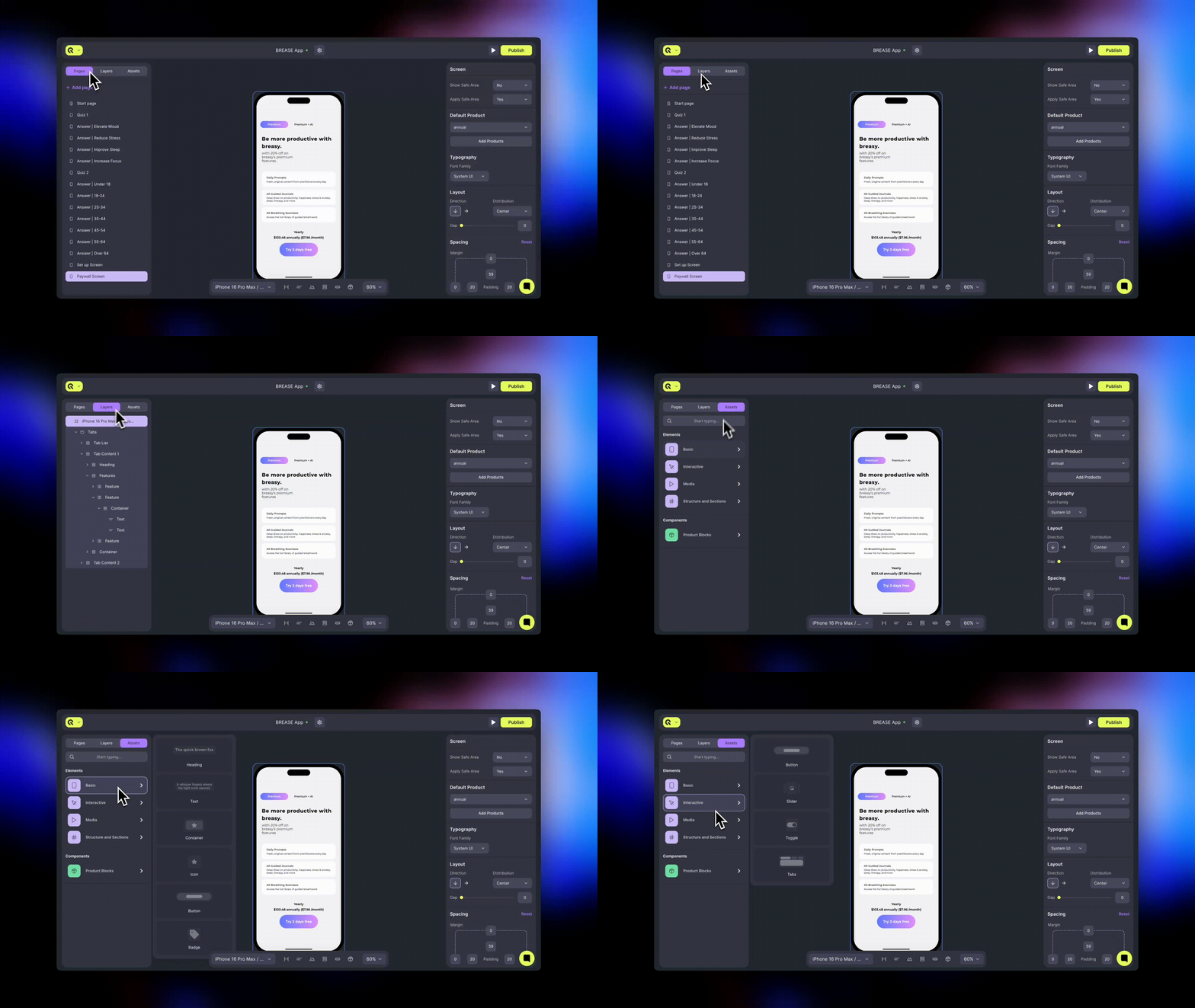 ***
#### Pages
Manage and organize your app screens within a project.
* Create and manage multiple pages within the same screen set (e.g., paywall + thank-you page).
* Click **+ Add Page** to create a new one.
* Reorder or rename pages at any time.
* The currently active page is highlighted (e.g., **Start Page**).
This is where you’ll switch between **single-page** and **multi-page** screens when building onboarding flows.
***
#### Layers
View and organize all elements currently on your selected page.
* Manage the **hierarchy and nesting** of containers and components.
* Lock or hide specific layers for easier editing.
* Reorder components with drag-and-drop.
Layers reflect your current **Canvas** structure in real time.
***
#### Assets
Access and add ready-to-use components and elements.
**Elements**:
* **Basic** – headings, text, buttons, containers
* **Interactive** – toggles, sliders, tabs
* **Media** – images, GIFs, Lottie files, (video coming soon)
* **Structure** and **Sections** – pre-built headers, footers, and layout blocks
**Components:**
* **Product Blocks** – pre-filled elements linked to your Qonversion products
You can also use the **search bar** to quickly find a component or element type.
***
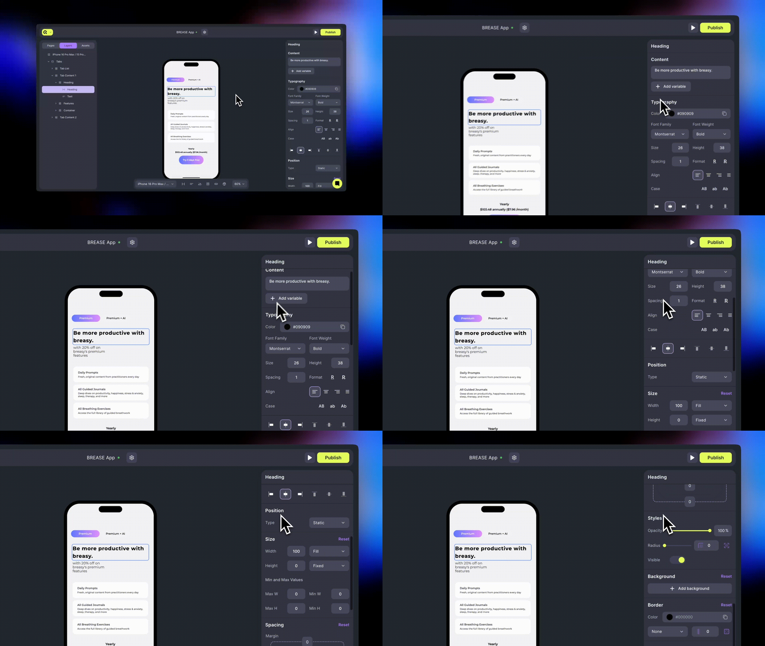
#### Right Sidebar (Properties)
Shows detailed settings for the selected component.
Here you can customize:
* Layout and positioning
* Icons, Actions, Content and Variables
* Typography and colors
* Borders, shadows, and backgrounds
* Visibility and behavior
and more.
***
#### Pages
Manage and organize your app screens within a project.
* Create and manage multiple pages within the same screen set (e.g., paywall + thank-you page).
* Click **+ Add Page** to create a new one.
* Reorder or rename pages at any time.
* The currently active page is highlighted (e.g., **Start Page**).
This is where you’ll switch between **single-page** and **multi-page** screens when building onboarding flows.
***
#### Layers
View and organize all elements currently on your selected page.
* Manage the **hierarchy and nesting** of containers and components.
* Lock or hide specific layers for easier editing.
* Reorder components with drag-and-drop.
Layers reflect your current **Canvas** structure in real time.
***
#### Assets
Access and add ready-to-use components and elements.
**Elements**:
* **Basic** – headings, text, buttons, containers
* **Interactive** – toggles, sliders, tabs
* **Media** – images, GIFs, Lottie files, (video coming soon)
* **Structure** and **Sections** – pre-built headers, footers, and layout blocks
**Components:**
* **Product Blocks** – pre-filled elements linked to your Qonversion products
You can also use the **search bar** to quickly find a component or element type.
***
#### Right Sidebar (Properties)
Shows detailed settings for the selected component.
Here you can customize:
* Layout and positioning
* Icons, Actions, Content and Variables
* Typography and colors
* Borders, shadows, and backgrounds
* Visibility and behavior
and more.
 ***
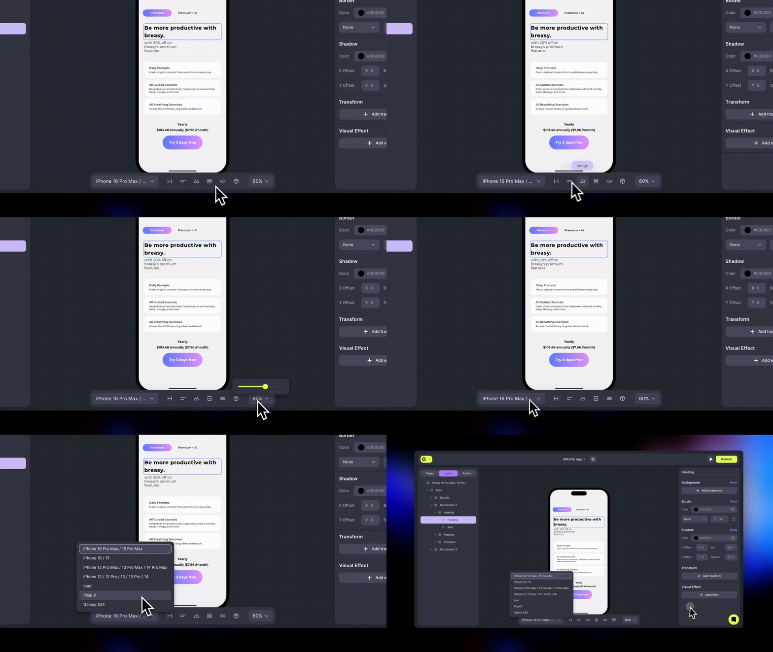
#### Flow Bar
The Flow Bar gives you quick access to the most commonly used tools and preview controls. It includes:
* A set of frequently used components for faster editing
* Zoom controls to adjust your view of the Canvas
* A device selector to preview your layout on iOS, Android, and tablet screens
Use it to fine-tune your design across devices and ensure responsive layout behavior.
***
#### Flow Bar
The Flow Bar gives you quick access to the most commonly used tools and preview controls. It includes:
* A set of frequently used components for faster editing
* Zoom controls to adjust your view of the Canvas
* A device selector to preview your layout on iOS, Android, and tablet screens
Use it to fine-tune your design across devices and ensure responsive layout behavior.
 ***
## Publishing & Versioning
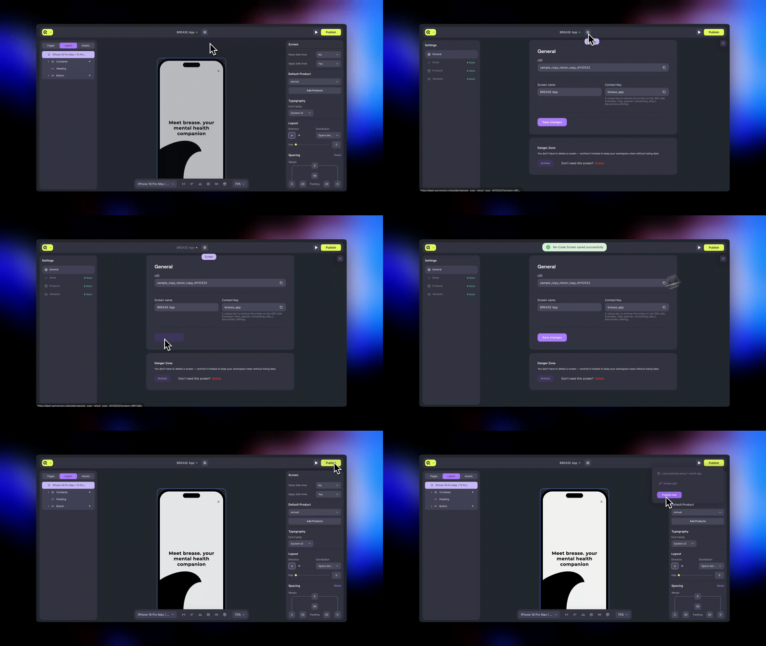
Before publishing your screen, you’ll need to assign a **Context Key** — a unique identifier that links the screen you build in Qonversion to your app through the SDK.
* Click **Settings** in the top bar and enter a descriptive name (for example, *main\_paywall* or *onboarding\_flow*).
* Once the key is set, click **Publish** in the top-right corner.
Publishing makes your screen available to be called via SDK — no app update or store release required. However, the screen will only appear in your app after you call its **Context Key** from your code.
***
## Publishing & Versioning
Before publishing your screen, you’ll need to assign a **Context Key** — a unique identifier that links the screen you build in Qonversion to your app through the SDK.
* Click **Settings** in the top bar and enter a descriptive name (for example, *main\_paywall* or *onboarding\_flow*).
* Once the key is set, click **Publish** in the top-right corner.
Publishing makes your screen available to be called via SDK — no app update or store release required. However, the screen will only appear in your app after you call its **Context Key** from your code.
 ***
[Product Setup & Store Connection](product-setup-store-connection-1)
[Components](components)
***
[Product Setup & Store Connection](product-setup-store-connection-1)
[Components](components)