> ## Documentation Index
> Fetch the complete documentation index at: https://documentation.qonversion.io/llms.txt
> Use this file to discover all available pages before exploring further.
# CTA Buttons
> Call-to-action button templates designed to drive conversions. Each template includes a pre-styled button with optional supporting text, icons, and visual effects.
All CTA Button templates support:
* **Make Purchase action** — ready to connect to your products
* **Full customization** — colors, fonts, shadows, gradients
* **Responsive design** — adapts to different screen widths
***
### Simple Black
A clean, minimalist black button with white text. Perfect for straightforward calls-to-action.
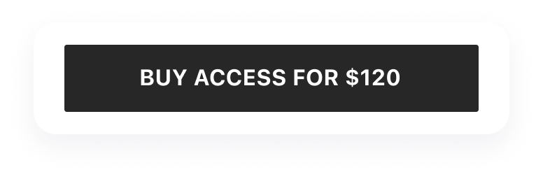 **Features:**
* Solid black background
* Centered text label
* Rounded corners
* Hover/press state styling
**Use for:**
* Primary purchase buttons
* Simple "Continue" or "Subscribe" actions
* Minimalist paywall designs
***
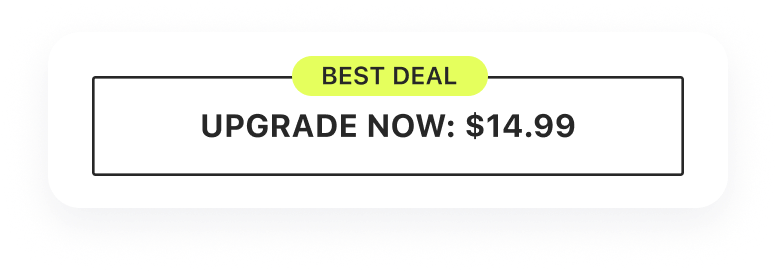
### Extra Text
A button with additional descriptive text below and stroke effect styling.
**Features:**
* Solid black background
* Centered text label
* Rounded corners
* Hover/press state styling
**Use for:**
* Primary purchase buttons
* Simple "Continue" or "Subscribe" actions
* Minimalist paywall designs
***
### Extra Text
A button with additional descriptive text below and stroke effect styling.
 **Features:**
* Main action text
* Supporting description text below
* Stroke/outline effect
* Two-line layout
**Use for:**
* Buttons with price or trial information
* Actions that need additional context
* Promotional CTAs with details
***
### Icon Gradient
A vibrant button with an icon and gradient background for maximum visual impact.
**Features:**
* Main action text
* Supporting description text below
* Stroke/outline effect
* Two-line layout
**Use for:**
* Buttons with price or trial information
* Actions that need additional context
* Promotional CTAs with details
***
### Icon Gradient
A vibrant button with an icon and gradient background for maximum visual impact.
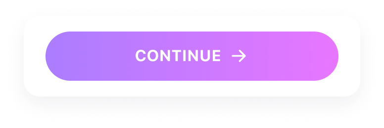 **Features:**
* Customizable icon (left-aligned)
* Gradient background
* Bold text styling
* Eye-catching visual treatment
**Use for:**
* Premium upgrade buttons
* Feature unlock actions
* High-conversion CTAs
***
### Two Line Shadow
A two-line button with shadow effect and supporting text for detailed calls-to-action.
**Features:**
* Customizable icon (left-aligned)
* Gradient background
* Bold text styling
* Eye-catching visual treatment
**Use for:**
* Premium upgrade buttons
* Feature unlock actions
* High-conversion CTAs
***
### Two Line Shadow
A two-line button with shadow effect and supporting text for detailed calls-to-action.
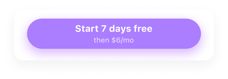 **Features:**
* Primary action text (large)
* Secondary description text (smaller)
* Drop shadow effect
* Professional card-like appearance
**Use for:**
* Subscription buttons with pricing
* Trial start actions with duration info
* Premium CTAs with value proposition
***
## Customization
After adding a CTA Button template, you can customize:
**Visual styling:**
* Background color or gradient
* Text colors and typography
* Border radius and shadows
* Icon selection and color
**Content:**
* Main button text
* Supporting description text
* Icon choice
**Behavior:**
* Action type (Make Purchase, Open URL, Go to Page)
* Linked product for purchases
***
## Best Practices
* **Use action-oriented text** — "Start Free Trial" is better than "Submit"
* **Include value proposition** — add pricing or benefit in secondary text
* **Make it prominent** — CTA should be the most visible element
* **Test different styles** — gradient buttons often outperform flat ones
* **Position strategically** — place above the fold and after key benefits
* **Use consistent styling** — match your app's brand colors
***
***
[Carousels](carousels)
[Feature List](feature-list)
**Features:**
* Primary action text (large)
* Secondary description text (smaller)
* Drop shadow effect
* Professional card-like appearance
**Use for:**
* Subscription buttons with pricing
* Trial start actions with duration info
* Premium CTAs with value proposition
***
## Customization
After adding a CTA Button template, you can customize:
**Visual styling:**
* Background color or gradient
* Text colors and typography
* Border radius and shadows
* Icon selection and color
**Content:**
* Main button text
* Supporting description text
* Icon choice
**Behavior:**
* Action type (Make Purchase, Open URL, Go to Page)
* Linked product for purchases
***
## Best Practices
* **Use action-oriented text** — "Start Free Trial" is better than "Submit"
* **Include value proposition** — add pricing or benefit in secondary text
* **Make it prominent** — CTA should be the most visible element
* **Test different styles** — gradient buttons often outperform flat ones
* **Position strategically** — place above the fold and after key benefits
* **Use consistent styling** — match your app's brand colors
***
***
[Carousels](carousels)
[Feature List](feature-list)