> ## Documentation Index
> Fetch the complete documentation index at: https://documentation.qonversion.io/llms.txt
> Use this file to discover all available pages before exploring further.
# Creating No-Code Screens
Qonversion No-Code Builder 2.0 introduces a key change in how the builder functions. This version is based on components and properties, allowing you to customize designs to fit your needs.
***
## Understanding the No-Code Builder
| Element | Description | Function |
| :----------------------- | :--------------------------------------------------------------------------------------------------------------------------------------- | :------------------------------------------- |
| **Canvas** | Your screen-shaped, adaptive artboard where you design your layout. | Holds and organizes all components |
| **Components** | Pre-designed UI elements such as headings, text, buttons, products, and slides that you can add to your canvas. | Used to build screens visually |
| **Component Properties** | Customizable attributes such as styles, decorations, sizes and more. | Controls appearance and behavior |
| **Parent Components** | Containers that hold other components | Group and control multiple elements together |
| **Templates** | Pre-built paywall templates that allow you to quickly create screens by adjusting them to your project instead of starting from scratch. | Helps create screens faster |
***
### Components
| Component | Description | Function |
| :------------ | :------------------------------------------------ | :-------------------------------------------- |
| **Heading** | Displays text or macros using the /h1 tag | Adds titles or important text elements |
| **Text** | Displays text or macros using the /p tag | Adds body text, descriptions, or instructions |
| **Image** | Displays an uploaded image or GIF | Displays an uploaded image or GIF |
| **Product** | Displays a selectable product with custom styling | Showcases in-app purchases or subscriptions |
| **Slider** | A parent component that holds multiple slides | Enables swipeable content sections |
| **Container** | A parent component that groups other components | Organizes and structures multiple elements |
| **Slide** | A child component inside a slider | Holds other components within a slider |
| **Button** | A clickable call-to-action element | Triggers a purchase attempt or other action |
***
#### Container-Based Components
A **Container** is a parent component that groups multiple components together, helping to organize and structure elements within your design. It acts as a flexible layout tool that allows you to control the positioning, spacing, and appearance of its child components.
Some components function as container-based elements but come pre-filled with content to simplify the design process. These include:
* **Slides** – Used within a Slider component to structure multi-step or swipeable content.
* **Buttons** – Pre-configured call-to-action elements designed to trigger user interactions, such as purchases.
* **Products** – Pre-filled with selectable in-app purchases, allowing for easy customization of product display and styling.
By using container-based components, you can efficiently organize and manage your screen’s layout without starting from scratch.
***
## Getting Started with Qonversion No-Code Builder 2.0
Qonversion No-Code Builder 2.0 lets you design and customize paywall screens effortlessly—no coding required. This guide will walk you through the process step by step.
### Creating a New Screen
1. Navigate to **No-Code Screens** from the menu.
2. Choose how you want to build your paywall:
1. **Use a Template** – For a quick start, browse **Templates** and select a pre-built design.
2. **Start from Scratch** – Click **Create New Screen** for full creative control.
> 📘 Tip
>
> Unless you have a highly custom design in mind, we recommend starting with a template. You can still tweak every detail to fit your needs—it simply gives you a solid foundation to build on.
***
### Using the Editor
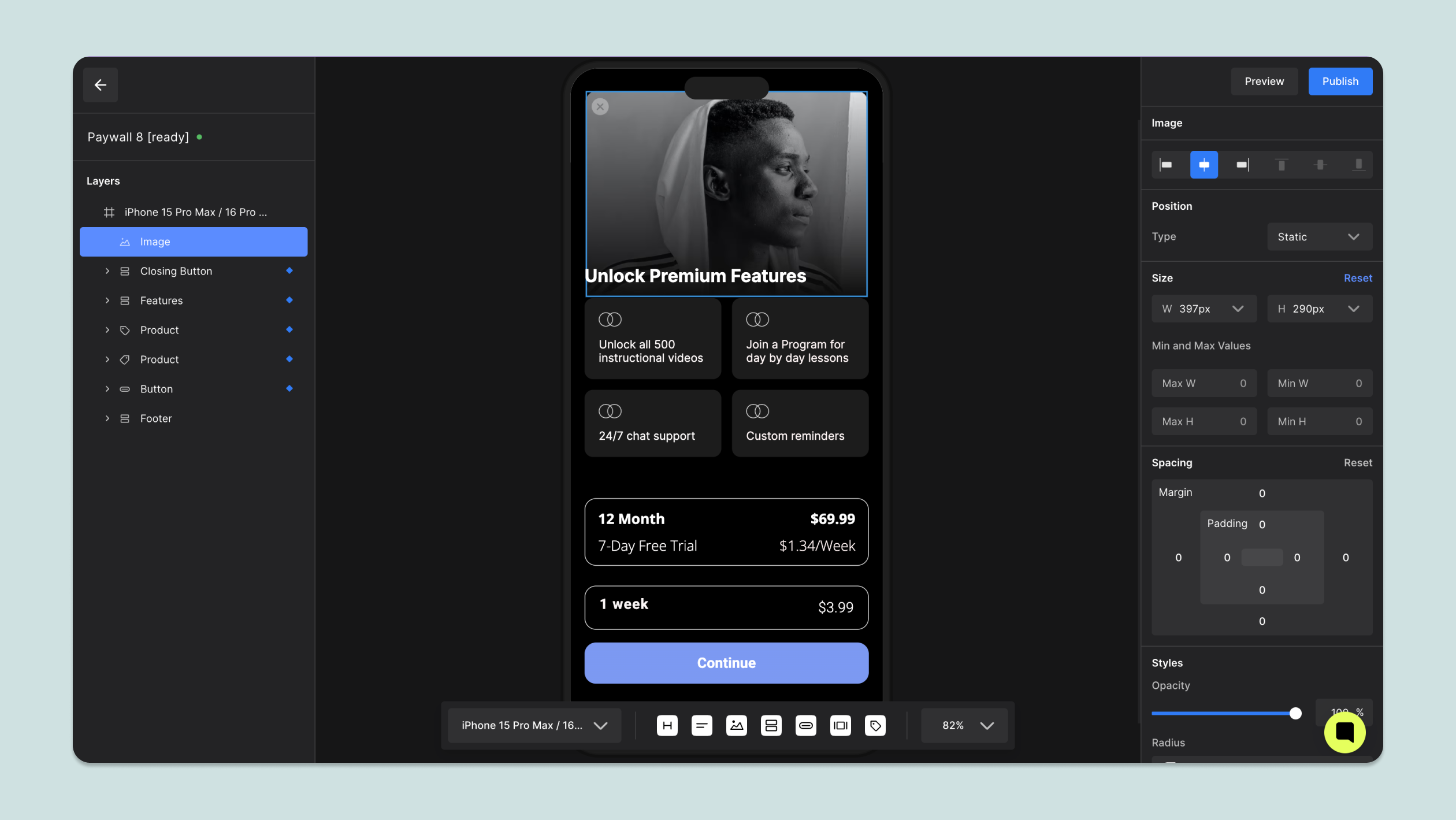
Once you've chosen a template or opted to design from scratch, you'll enter the No-Code Builder, which consists of the following sections:
1. **Left Sidebar** – Displays the list of components in your paywall, their hierarchy, and options such as renaming and duplicating.
2. **Right Sidebar** (Control Panel) – Shows configurable properties for the selected component, allowing you to customize styles, sizes, and other settings.
3. **Preview Area** – Provides a real-time preview of your paywall as you edit.
4. **Flow Bar** – Offers tools to:
1. Add components to the canvas.
2. Adjust screen size using preset device layouts.
3. Zoom in and out for precise editing.
 ***
### Adding and Modifying Components
#### Adding Components to the Canvas
You can add components to your canvas using the **Flow Bar.** Once a component is placed on your paywall, you can:
1. Reorder Components – Drag a component vertically within the stack to change its position.
2. Set Parent Components – Drag a component underneath a desired parent and indent it horizontally to nest it within that component.
***
### Adding and Modifying Components
#### Adding Components to the Canvas
You can add components to your canvas using the **Flow Bar.** Once a component is placed on your paywall, you can:
1. Reorder Components – Drag a component vertically within the stack to change its position.
2. Set Parent Components – Drag a component underneath a desired parent and indent it horizontally to nest it within that component.
 #### Modifying Components
To customize a component:
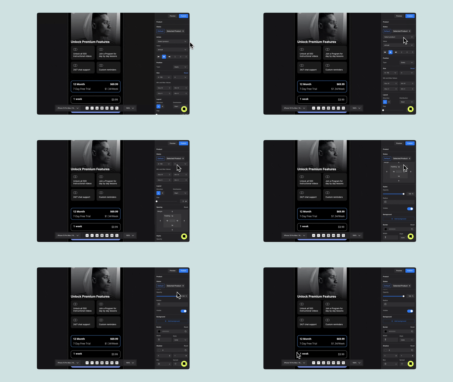
1. Click on the component directly on the canvas or select it from the Left Sidebar.
The component’s properties will appear in the Right Sidebar (Control Panel).
2. Adjust its styles, size, layout, and other configurable settings to match your design
#### Modifying Components
To customize a component:
1. Click on the component directly on the canvas or select it from the Left Sidebar.
The component’s properties will appear in the Right Sidebar (Control Panel).
2. Adjust its styles, size, layout, and other configurable settings to match your design
 ***
#### Saving a Paywall
Paywalls are automatically saved every 5 seconds to ensure you don’t lose progress. However, saving and publishing are two different actions depending on your paywall’s readiness:
| Paywall State | Description |
| :------------ | :----------------------------------------------------------------------------------------------------------------------------- |
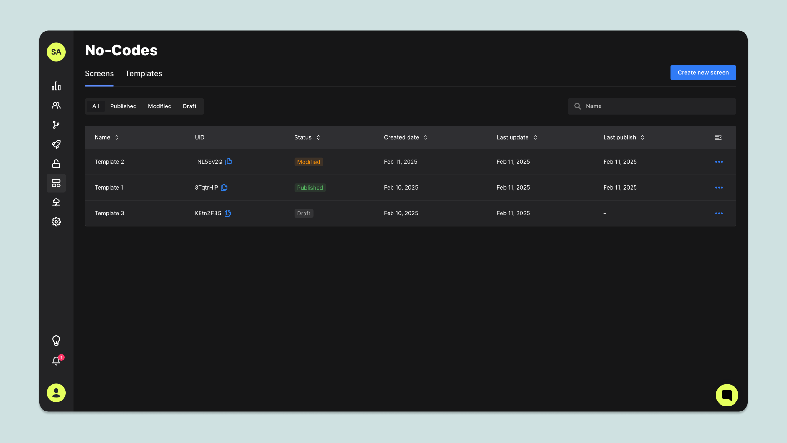
| Draft | Never published and still a work in progress. It won’t show up in the SDK. |
| Modified | A published paywall that’s been updated but not re-published yet. The old version is still live until you publish the changes. |
| Published | Live and available through the SDK |
***
#### Saving a Paywall
Paywalls are automatically saved every 5 seconds to ensure you don’t lose progress. However, saving and publishing are two different actions depending on your paywall’s readiness:
| Paywall State | Description |
| :------------ | :----------------------------------------------------------------------------------------------------------------------------- |
| Draft | Never published and still a work in progress. It won’t show up in the SDK. |
| Modified | A published paywall that’s been updated but not re-published yet. The old version is still live until you publish the changes. |
| Published | Live and available through the SDK |
 #### How to Save & Publish
1. Auto-Save: No worries—your work saves every 5 seconds while you edit ✨
2. Publishing: Click Publish Paywall to push your changes live. Modified paywalls won’t update until you re-publish.
#### How to Save & Publish
1. Auto-Save: No worries—your work saves every 5 seconds while you edit ✨
2. Publishing: Click Publish Paywall to push your changes live. Modified paywalls won’t update until you re-publish.
