> ## Documentation Index
> Fetch the complete documentation index at: https://documentation.qonversion.io/llms.txt
> Use this file to discover all available pages before exploring further.
# Components
> Every screen in the No-Code Builder is made up of components — reusable, modular elements that define structure, content, and behavior.
You can combine components freely to build anything from a single-page paywall to a multi-screen onboarding flow.
Each component supports a unique set of properties, which can be configured in the Right Panel. Below you’ll find an overview of all available components, grouped by category, with quick links to their common use cases and key properties.
***
## Components Reference Table
| Component | Parent | Actions | Description | Function |
| --------------- | ------ | ------- | -------------------------------------------------------------------------- | -------------------------------------------------------- |
| **Container** | ✅ | ✅ | Core layout block that groups and aligns other components. | Organizes and structures multiple elements |
| **Button** | ✅ | ✅ | A clickable call-to-action element | Triggers a purchase attempt or other action |
| **Product** | ✅ | ✅ | Displays a selectable product with customizable styling | Showcases in-app purchases or subscriptions |
| **Heading** | ❌ | ❌ | Text block for titles using the /h1 tag | Adds main headings or key messages |
| **Text** | ❌ | ❌ | Text block for descriptions, disclaimers, or variables using the /p tag | Adds body text, descriptions, or instructions |
| **Toggle** | ❌ | ✅ | Switch element for selecting between two states (e.g., Monthly vs. Yearly) | Changes product selection |
| **Tabs** | ✅ | ❌ | Segmented layout component for switching between different content states | Enables navigation between grouped sections |
| **Tab** | ✅ | ❌ | Child element inside Tabs | Holds content for a single tab view |
| **Badge** | ✅ | ✅ | Styled tag for emphasis (e.g., “Best Value,” “Limited Offer”). | Highlights products, offers, or section |
| **Image/GIF** | ❌ | ❌ | Displays static or animated visuals | Adds images or GIFs to enhance visual design. |
| **Icon** | ❌ | ✅ | Small decorative or functional icon element | Adds visual cues, or can be used as a **closing** button |
| **Lottie** | ❌ | ❌ | Vector animation file with dynamic scaling | Adds lightweight animations or motion effects |
| **Video** | ❌ | ❌ | Embeddable video player | Displays product demos or looping backgrounds |
| **Slider** | ✅ | ❌ | Parent container that holds multiple Slides | Enables swipeable multi-page content |
| **Slide** | ✅ | ❌ | Child component inside a Slider | Holds elements within each swipeable section |
| **Quiz** | ✅ | ❌ | Parent container for quiz layouts with selectable options | Captures user input or preferences in onboarding flows |
| **Star Rating** | ❌ | ❌ | Display-only star rating element with partial-fill support | Shows ratings on social-proof and review templates |
| **Header** | ✅ | ❌ | Pre-built top section with standard layout and styling. | Used for consistent screen headers |
| **Footer** | ✅ | ❌ | Pre-built bottom section with standard layout and styling. | Used for CTAs, legal text, or navigation. |
**Parent Components** can contain other elements inside them.
* Actions include functions like **Make Purchase**, **Open URL**, **Go to Page**, or **Select Product** and more.
* Components can be freely combined to create custom layouts.
***
## Layout Components
### Container
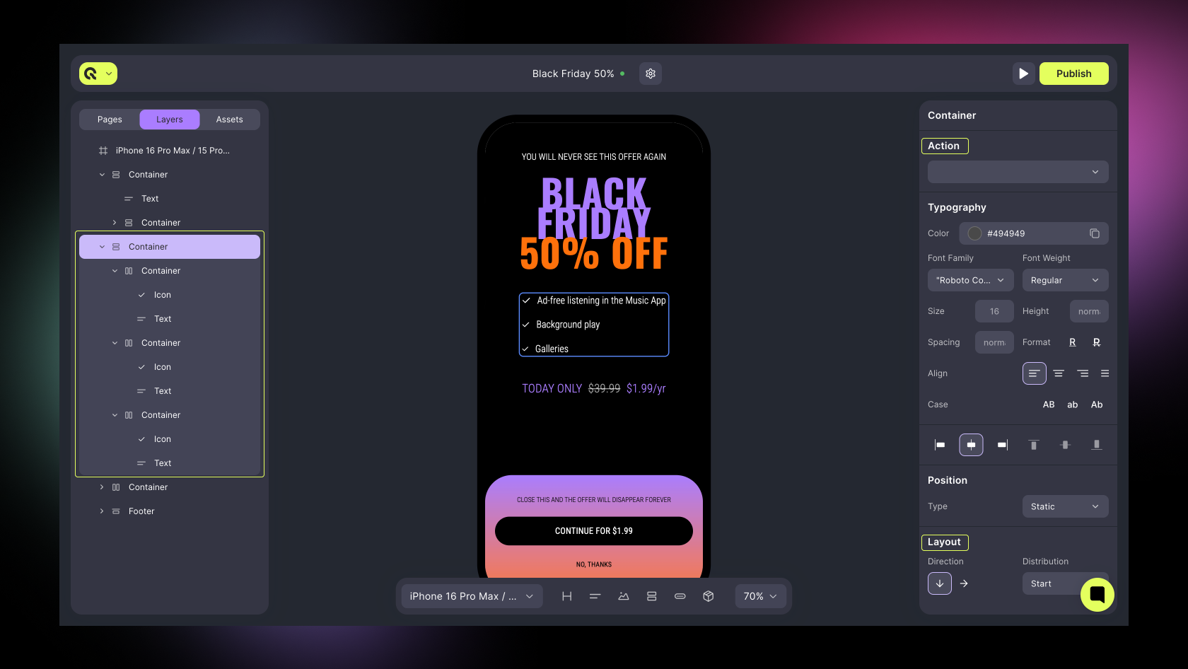
The **Container** is the foundational layout block in the **Builder**. It’s used to group and align multiple elements and can be nested inside other containers for flexible layout control.
**Use cases:**
* Creating columns, cards, or grouped sections
* Holding text, buttons, and images together
* Structuring responsive paywall layouts
**Key properties:**
* Action
* Layout (direction, distribution, wrap, gap)
* Alignment
* Position (static, relative, absolute, fixed, sticky)
* Size (fill, fit, auto, fixed)
* Spacing (margin, padding)
* Background, Border, Shadow
* Selected State (if linked to product)
**Tip:** Use containers as “cards” for product blocks or grouped pricing sections.
 ***
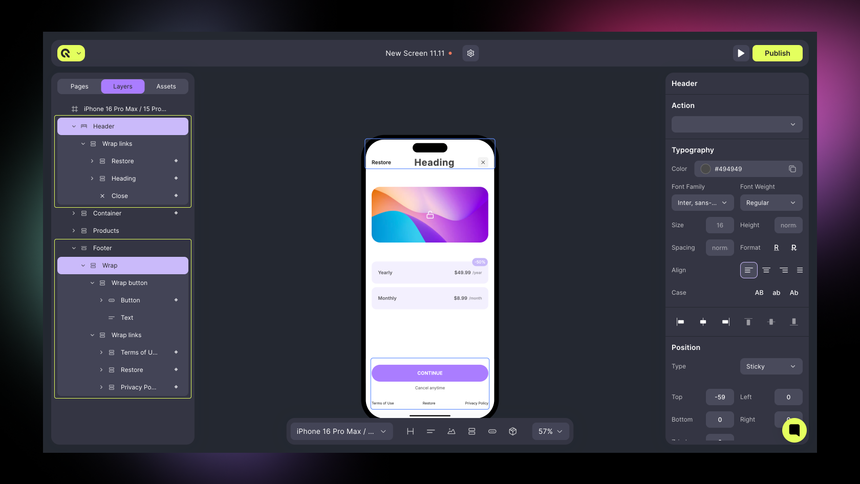
### Header / Footer (Pre-Built)
Pre-designed layout sections that maintain consistent structure across screens.
* **Header**: Ideal for app logos, titles, or progress indicators.
* **Footer**: Perfect for CTAs, purchase buttons, or legal text.
**Important:**
* You can add only **one** **Header** and **one** **Footer** per screen.
* Both are placed automatically at the top and bottom of the layout.
* Their main property is **Positioning**, which is **Static** — they remain anchored in their respective places and do not scroll independently.
**Key properties:**
* **Alignment** – controls horizontal content placement (Start, Center, End).
* **Padding / Background** – adjust internal spacing and visual styling.
* **Typography** – inherit or override font family, weight, and color for text elements.
* **Static Position** – ensures Header and Footer stay fixed to screen boundaries (not scrollable).
***
### Header / Footer (Pre-Built)
Pre-designed layout sections that maintain consistent structure across screens.
* **Header**: Ideal for app logos, titles, or progress indicators.
* **Footer**: Perfect for CTAs, purchase buttons, or legal text.
**Important:**
* You can add only **one** **Header** and **one** **Footer** per screen.
* Both are placed automatically at the top and bottom of the layout.
* Their main property is **Positioning**, which is **Static** — they remain anchored in their respective places and do not scroll independently.
**Key properties:**
* **Alignment** – controls horizontal content placement (Start, Center, End).
* **Padding / Background** – adjust internal spacing and visual styling.
* **Typography** – inherit or override font family, weight, and color for text elements.
* **Static Position** – ensures Header and Footer stay fixed to screen boundaries (not scrollable).
 ***
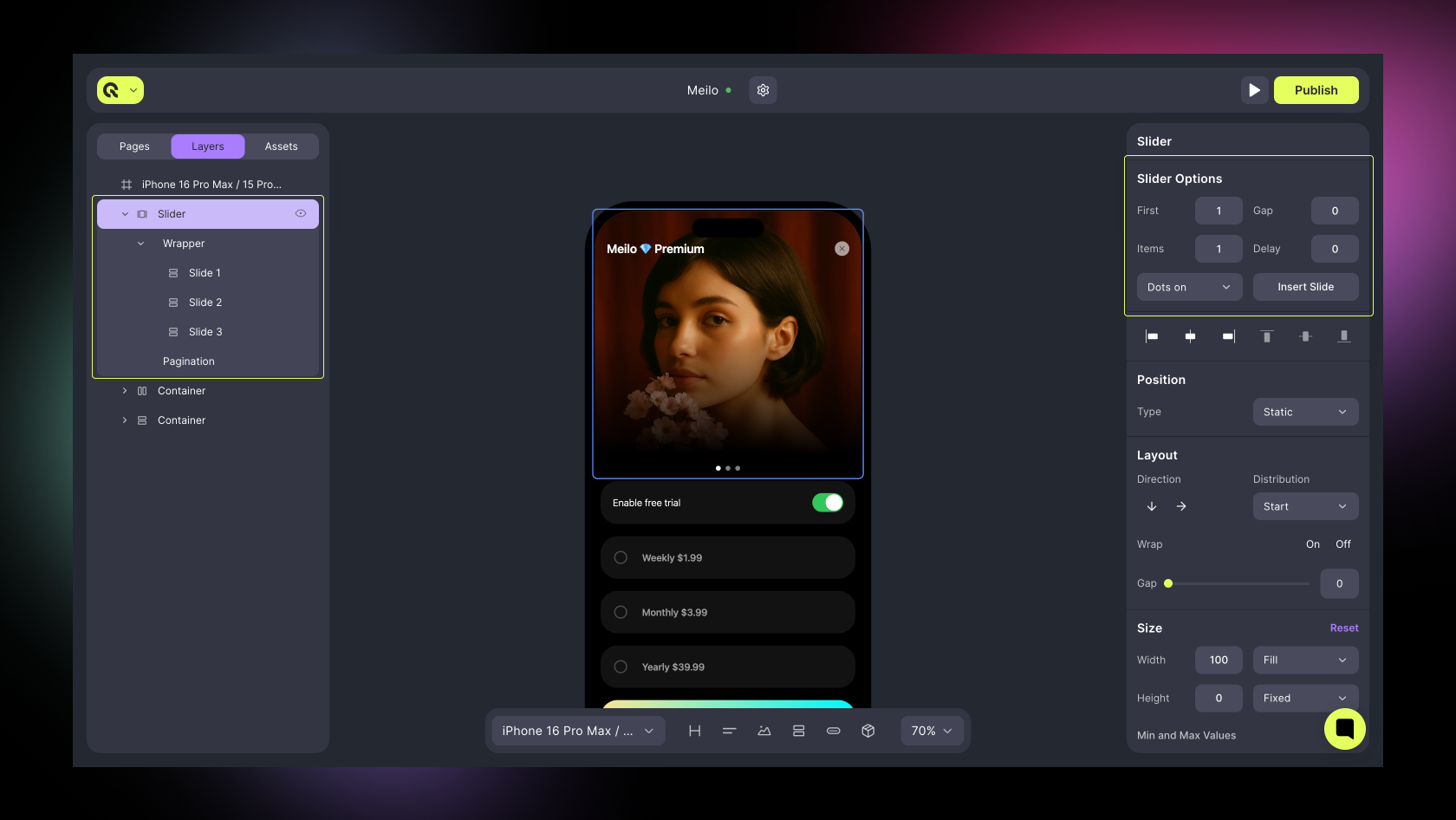
### Slider
A horizontal parent container used to create swipeable multi-step experiences.
**Use for:**
* Onboarding flows
* Multi-card offers or tutorials
**Key properties:**
* Direction (horizontal)
* Slide count
* Gap between slides
#### Slide
A single page inside a Slider. Each slide has independent content and styling.
**Use for:**
* Onboarding step
* Product card or information screen
**Key properties:**
* **Background**, **Padding**, **Layout**, **Typography**
***
### Slider
A horizontal parent container used to create swipeable multi-step experiences.
**Use for:**
* Onboarding flows
* Multi-card offers or tutorials
**Key properties:**
* Direction (horizontal)
* Slide count
* Gap between slides
#### Slide
A single page inside a Slider. Each slide has independent content and styling.
**Use for:**
* Onboarding step
* Product card or information screen
**Key properties:**
* **Background**, **Padding**, **Layout**, **Typography**
 ***
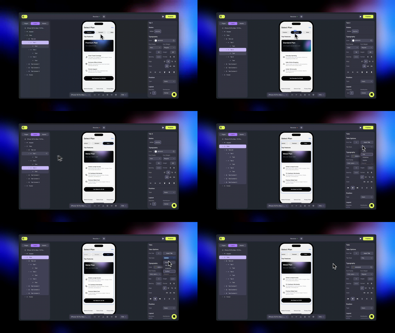
### Tabs
A segmented layout component for switching between grouped content areas.
**Use for:**
* Switching between plans (Monthly, Annual, Lifetime)
* Segmenting features or pricing groups
**Key properties:**
* Tab Items (add / rename / reorder)
* Linked Containers or Product Groups
* Default Tab
* Orientation (horizontal / vertical)
* Active / Inactive styles
#### Tab
A single view or section within the Tabs component.
**Use for:**
* Each pricing plan or content block linked to a tab selection.
**Key properties:**
* Layout
* Padding / Margin
* Background
***
### Tabs
A segmented layout component for switching between grouped content areas.
**Use for:**
* Switching between plans (Monthly, Annual, Lifetime)
* Segmenting features or pricing groups
**Key properties:**
* Tab Items (add / rename / reorder)
* Linked Containers or Product Groups
* Default Tab
* Orientation (horizontal / vertical)
* Active / Inactive styles
#### Tab
A single view or section within the Tabs component.
**Use for:**
* Each pricing plan or content block linked to a tab selection.
**Key properties:**
* Layout
* Padding / Margin
* Background
 ***
## Text & Display Components
### Heading
Large text element used for titles, section headers, or key messages.
**Use for:**
* Paywall headline (“Upgrade to Premium”)
* Onboarding step titles
**Key properties:**
* Typography (font, weight, color, size and more)
* Alignment
* Margin / Padding
* Variables (dynamic product data)
***
### Text
Smaller text element used for supporting details or variable-based descriptions.
**Use for:**
* Feature lists
* Descriptions and disclaimers
* Dynamic price or period text
**Key properties:**
* Typography (font, color, size)
* Alignment
* Variables (e.g., products.product\_id.price\_per\_month)
* Margin / Padding
***
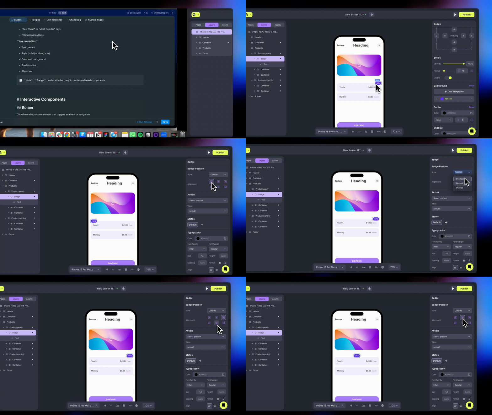
### Badge
A small highlighted label that draws attention to offers or key information.
**Use for:**
* “Best Value” or “Most Popular” tags
* Promotional callouts
**Key properties:**
* Text content
* Style (solid / outline / soft)
* Color and background
* Border radius
* Alignment
**Note**: **Badge** can be attached only to container-based components.
***
## Text & Display Components
### Heading
Large text element used for titles, section headers, or key messages.
**Use for:**
* Paywall headline (“Upgrade to Premium”)
* Onboarding step titles
**Key properties:**
* Typography (font, weight, color, size and more)
* Alignment
* Margin / Padding
* Variables (dynamic product data)
***
### Text
Smaller text element used for supporting details or variable-based descriptions.
**Use for:**
* Feature lists
* Descriptions and disclaimers
* Dynamic price or period text
**Key properties:**
* Typography (font, color, size)
* Alignment
* Variables (e.g., products.product\_id.price\_per\_month)
* Margin / Padding
***
### Badge
A small highlighted label that draws attention to offers or key information.
**Use for:**
* “Best Value” or “Most Popular” tags
* Promotional callouts
**Key properties:**
* Text content
* Style (solid / outline / soft)
* Color and background
* Border radius
* Alignment
**Note**: **Badge** can be attached only to container-based components.
 ***
### Star Rating
Display-only element that renders a configurable star rating with partial-fill support. Useful as a standalone trust indicator or as the visual primitive behind every review template - see the [Social Proof](social-proof) category for ready-made templates that use it.
**Use for:**
* Inline rating badges in headers
* Trust indicators near CTAs
* Custom social-proof layouts
**Key properties:**
* **Rating** — value from 0-5, supports decimals (e.g., 4.9 renders as 4 full stars + 1 star at 90% fill)
* **Max Stars** — maximum number of stars to display
* **Size** — star size in pixels
* **Fill Color** — color for filled stars
* **Empty Color** — color for unfilled stars
* **Gap** — spacing between stars in pixels
***
## Interactive Components
### Button
Clickable call-to-action element that triggers an event or navigation.
Use for:
* “Continue”, “Subscribe”, or “Buy Now” actions
* Navigating between pages or screens
Key properties:
* Action (Make Purchase, Select Product, Open URL, Go to Page, Show Screen)
* Label text (supports variables)
* Size and alignment
* Background, Border, Shadow
* Typography (font, color, weight)
***
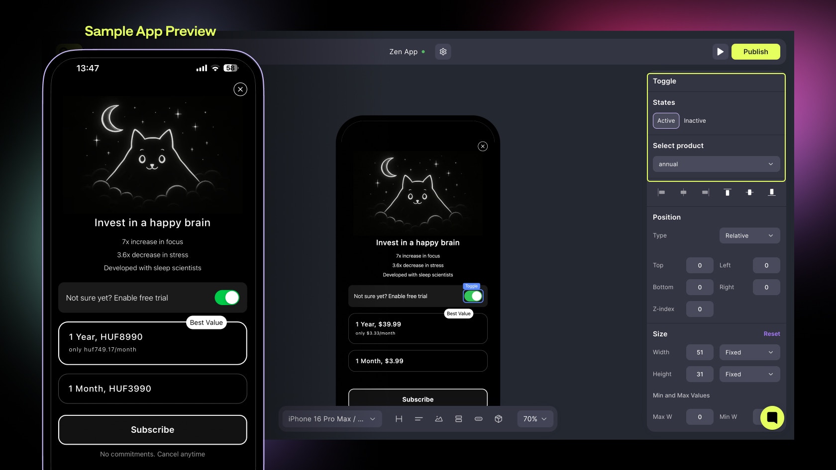
### Toggle
Switch component that changes between two or more states, commonly used for pricing options.
Use for:
* Monthly ↔ Yearly plan switchers
* Feature toggles
**Key properties:**
* Options (labels for each state)
* Default State
* Linked Products or Containers
* Action on Change
* Background and active/inactive text colors
Combine Toggles with Product Containers to dynamically update user selection. ***Changing Products on toggles is coming soon***
***
### Star Rating
Display-only element that renders a configurable star rating with partial-fill support. Useful as a standalone trust indicator or as the visual primitive behind every review template - see the [Social Proof](social-proof) category for ready-made templates that use it.
**Use for:**
* Inline rating badges in headers
* Trust indicators near CTAs
* Custom social-proof layouts
**Key properties:**
* **Rating** — value from 0-5, supports decimals (e.g., 4.9 renders as 4 full stars + 1 star at 90% fill)
* **Max Stars** — maximum number of stars to display
* **Size** — star size in pixels
* **Fill Color** — color for filled stars
* **Empty Color** — color for unfilled stars
* **Gap** — spacing between stars in pixels
***
## Interactive Components
### Button
Clickable call-to-action element that triggers an event or navigation.
Use for:
* “Continue”, “Subscribe”, or “Buy Now” actions
* Navigating between pages or screens
Key properties:
* Action (Make Purchase, Select Product, Open URL, Go to Page, Show Screen)
* Label text (supports variables)
* Size and alignment
* Background, Border, Shadow
* Typography (font, color, weight)
***
### Toggle
Switch component that changes between two or more states, commonly used for pricing options.
Use for:
* Monthly ↔ Yearly plan switchers
* Feature toggles
**Key properties:**
* Options (labels for each state)
* Default State
* Linked Products or Containers
* Action on Change
* Background and active/inactive text colors
Combine Toggles with Product Containers to dynamically update user selection. ***Changing Products on toggles is coming soon***
 ***
### Quiz
Parent container that renders a list or grid of selectable options. Use it to capture user input during onboarding flows or to personalise the rest of a paywall based on the answer.
**Use for:**
* Onboarding questions ("What's your goal?", "How experienced are you?")
* Preference capture before showing a tailored paywall
* Multi-step quizzes that branch into different screens
**Available templates:**
* **Simple** — single-select list of plain options
* **Multiple choice** — multi-select list
* **Emoji** — list with leading emojis per option
* **Icons** — list with leading icons per option
* **Image tiles** — 2-column grid of image tiles
Each Quiz contains child **Quiz Option** elements; selected options switch to a highlighted state automatically.
**Key properties:**
* Layout (list, image-tiles)
* Template (simple, multiple-choice, emoji, icons, image-tiles)
* Selected/default option styling
* Background, Border, Padding
* Linked navigation action on each option (Go to Page, Show Screen)
***
## Product Components
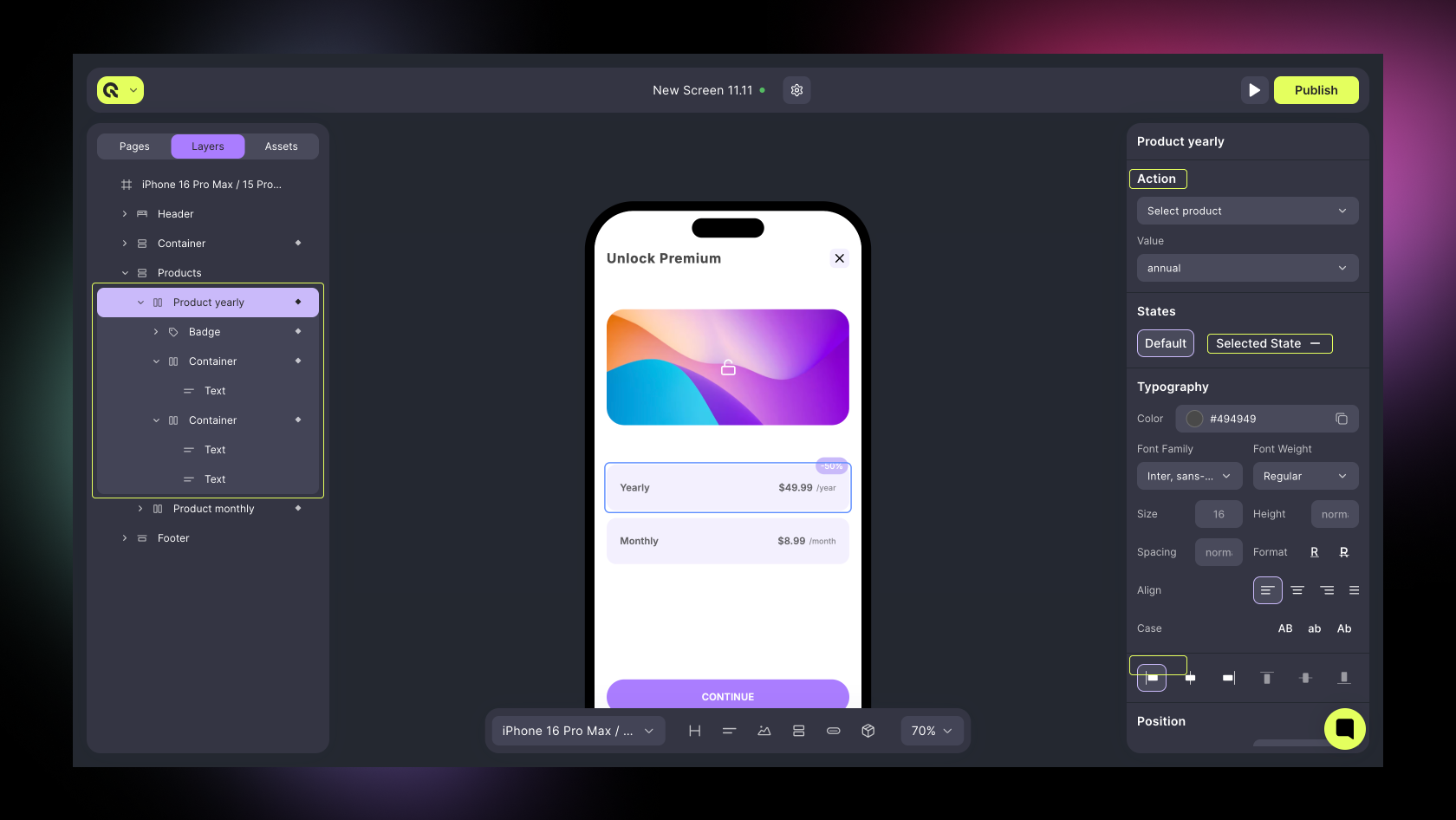
### Product
A pre-built container displaying subscription or one-time purchase details. Automatically filled with data from your connected store.
**Use for:**
* Main product or subscription cards
* Price comparison layouts
**Key properties:**
* Linked Product
* Layout (vertical / horizontal)
* Badge support
* Product Variables (price, trial\_period, currency)
* Background, Border, Shadow
* Action (Select Product, Make Purchase)
* Selected State styling
**Tip**: Group multiple Product components in one Container for multi-plan layouts.
***
### Quiz
Parent container that renders a list or grid of selectable options. Use it to capture user input during onboarding flows or to personalise the rest of a paywall based on the answer.
**Use for:**
* Onboarding questions ("What's your goal?", "How experienced are you?")
* Preference capture before showing a tailored paywall
* Multi-step quizzes that branch into different screens
**Available templates:**
* **Simple** — single-select list of plain options
* **Multiple choice** — multi-select list
* **Emoji** — list with leading emojis per option
* **Icons** — list with leading icons per option
* **Image tiles** — 2-column grid of image tiles
Each Quiz contains child **Quiz Option** elements; selected options switch to a highlighted state automatically.
**Key properties:**
* Layout (list, image-tiles)
* Template (simple, multiple-choice, emoji, icons, image-tiles)
* Selected/default option styling
* Background, Border, Padding
* Linked navigation action on each option (Go to Page, Show Screen)
***
## Product Components
### Product
A pre-built container displaying subscription or one-time purchase details. Automatically filled with data from your connected store.
**Use for:**
* Main product or subscription cards
* Price comparison layouts
**Key properties:**
* Linked Product
* Layout (vertical / horizontal)
* Badge support
* Product Variables (price, trial\_period, currency)
* Background, Border, Shadow
* Action (Select Product, Make Purchase)
* Selected State styling
**Tip**: Group multiple Product components in one Container for multi-plan layouts.
 ***
## Media Components
### Image / GIF
Displays static or animated visual content.
**Use for:**
* Product illustrations
* Onboarding artwork
* Decorative visuals
**Key properties:**
* Source (upload or URL)
* Fit (cover / contain)
* Border radius / shadows
* Alignment / Size
* Action (optional, e.g., Open URL)
***
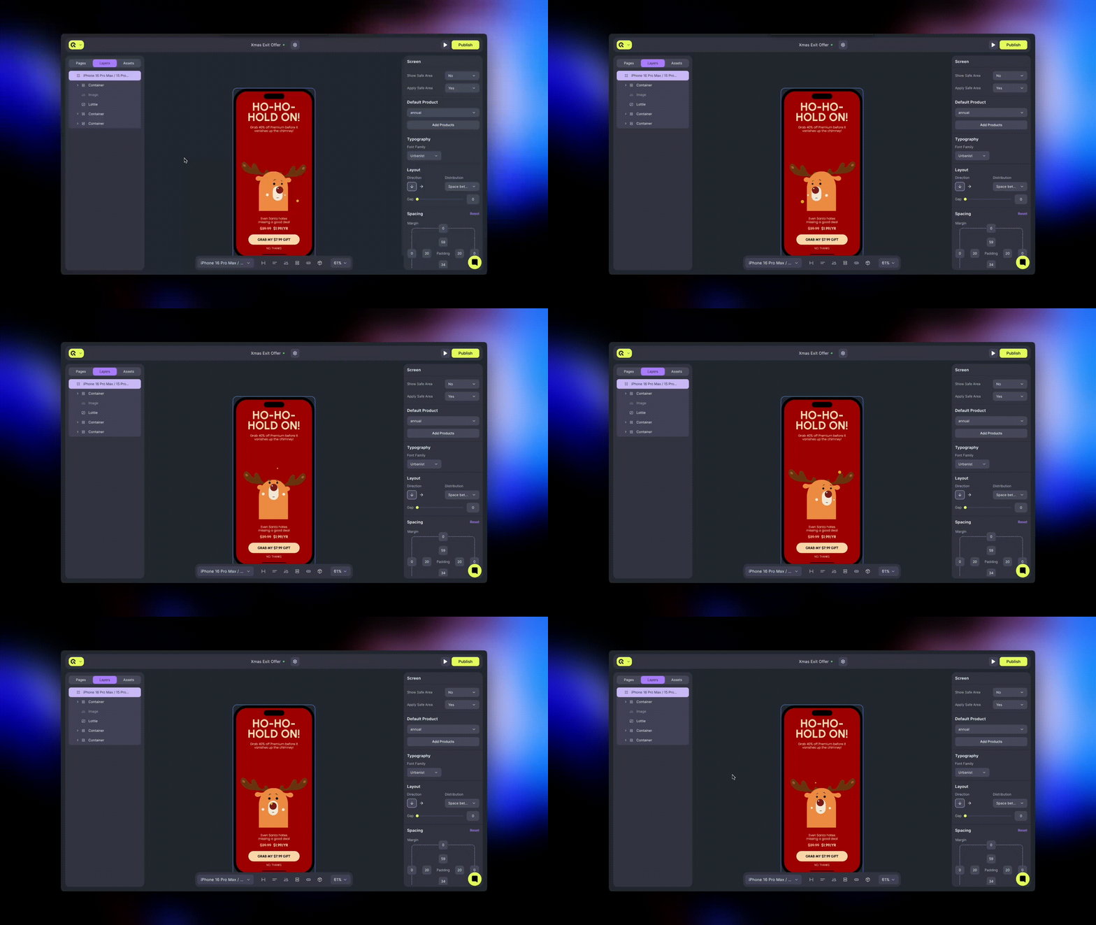
### Lottie File
Vector-based animation file (.json) for smooth, scalable motion graphics.
**Use for:**
* Onboarding animations
* Success or loading states
**Key properties:**
* Loop / Autoplay toggle
* Playback speed
* Alignment / Size
***
## Media Components
### Image / GIF
Displays static or animated visual content.
**Use for:**
* Product illustrations
* Onboarding artwork
* Decorative visuals
**Key properties:**
* Source (upload or URL)
* Fit (cover / contain)
* Border radius / shadows
* Alignment / Size
* Action (optional, e.g., Open URL)
***
### Lottie File
Vector-based animation file (.json) for smooth, scalable motion graphics.
**Use for:**
* Onboarding animations
* Success or loading states
**Key properties:**
* Loop / Autoplay toggle
* Playback speed
* Alignment / Size
 ***
### Icon
Simple decorative or functional symbol.
**Use for:**
* Feature checkmarks
* Navigation or visual cues
**Key properties:**
* Icon set and name
* Color and size
* Alignment
***
### Video
Embeddable video block for background loops or short product demos.
**Available properties:**
* Upload up to 150Mb
* Autoplay / Loop toggle
* Mute / Sound control
* Cover fit
***
#### Component Quick Reference
| **Component** | **Purpose** | **Supports Actions** | **Has Children** |
| --------------- | ---------------------------- | -------------------- | ---------------- |
| Container | Groups and aligns elements | ✅ | ✅ |
| Header / Footer | Standard layout sections | ❌ | ✅ |
| Slider | Swipeable parent layout | ❌ | ✅ |
| Slide | Page inside slider | ❌ | ✅ |
| Tabs | Switchable segmented view | ❌ | ✅ |
| Tab | Individual tab section | ❌ | ✅ |
| Heading | Large text element | ❌ | ❌ |
| Text | Description or dynamic value | ❌ | ❌ |
| Badge | Highlight tag | ✅ | ✅ |
| Button | Interactive call-to-action | ✅ | ❌ |
| Toggle | Multi-state switch | ✅ | ❌ |
| Quiz | Selectable option container | ❌ | ✅ |
| Star Rating | Display-only rating element | ❌ | ❌ |
| Product | Pre-filled product card | ✅ | ✅ |
| Image / GIF | Static or animated image | ❌ | ❌ |
| Lottie | Animation file | ❌ | ❌ |
| Icon | Decorative element | ✅ | ❌ |
| Video | Embedded media | ❌ | ❌ |
***
#### Best Practices
* **Start simple:** use pre-built containers and headers to create clean layouts.
* **Use variables** inside Text or Button components for dynamic pricing.
* **Link product actions** early (Select Product, Make Purchase) to test your screen logic.
* **Preview frequently**: test responsiveness on iOS, Android, and tablet devices.
### Prebuilt Components
Prebuilt components are ready-to-use component templates designed to accelerate paywall creation. Instead of assembling individual elements, you can drop in a complete, styled product block and customize it to match your brand.
***
Each template comes with:
* **Pre-configured structure** with placeholder content
* **Default and selected states** with automatic styling
* **Professional design** following Qonversion best practices
* **Full customization** — every property can be modified
***
#### How to Add a Prebuilt Component
1. Open the **Left Sidebar** in the Builder.
2. Navigate to **Components** section.
3. Select a category (e.g., **Product Blocks**).
4. Browse the visual previews to find your preferred layout.
5. **Click** on a template to add it to your canvas.
***
### Icon
Simple decorative or functional symbol.
**Use for:**
* Feature checkmarks
* Navigation or visual cues
**Key properties:**
* Icon set and name
* Color and size
* Alignment
***
### Video
Embeddable video block for background loops or short product demos.
**Available properties:**
* Upload up to 150Mb
* Autoplay / Loop toggle
* Mute / Sound control
* Cover fit
***
#### Component Quick Reference
| **Component** | **Purpose** | **Supports Actions** | **Has Children** |
| --------------- | ---------------------------- | -------------------- | ---------------- |
| Container | Groups and aligns elements | ✅ | ✅ |
| Header / Footer | Standard layout sections | ❌ | ✅ |
| Slider | Swipeable parent layout | ❌ | ✅ |
| Slide | Page inside slider | ❌ | ✅ |
| Tabs | Switchable segmented view | ❌ | ✅ |
| Tab | Individual tab section | ❌ | ✅ |
| Heading | Large text element | ❌ | ❌ |
| Text | Description or dynamic value | ❌ | ❌ |
| Badge | Highlight tag | ✅ | ✅ |
| Button | Interactive call-to-action | ✅ | ❌ |
| Toggle | Multi-state switch | ✅ | ❌ |
| Quiz | Selectable option container | ❌ | ✅ |
| Star Rating | Display-only rating element | ❌ | ❌ |
| Product | Pre-filled product card | ✅ | ✅ |
| Image / GIF | Static or animated image | ❌ | ❌ |
| Lottie | Animation file | ❌ | ❌ |
| Icon | Decorative element | ✅ | ❌ |
| Video | Embedded media | ❌ | ❌ |
***
#### Best Practices
* **Start simple:** use pre-built containers and headers to create clean layouts.
* **Use variables** inside Text or Button components for dynamic pricing.
* **Link product actions** early (Select Product, Make Purchase) to test your screen logic.
* **Preview frequently**: test responsiveness on iOS, Android, and tablet devices.
### Prebuilt Components
Prebuilt components are ready-to-use component templates designed to accelerate paywall creation. Instead of assembling individual elements, you can drop in a complete, styled product block and customize it to match your brand.
***
Each template comes with:
* **Pre-configured structure** with placeholder content
* **Default and selected states** with automatic styling
* **Professional design** following Qonversion best practices
* **Full customization** — every property can be modified
***
#### How to Add a Prebuilt Component
1. Open the **Left Sidebar** in the Builder.
2. Navigate to **Components** section.
3. Select a category (e.g., **Product Blocks**).
4. Browse the visual previews to find your preferred layout.
5. **Click** on a template to add it to your canvas.
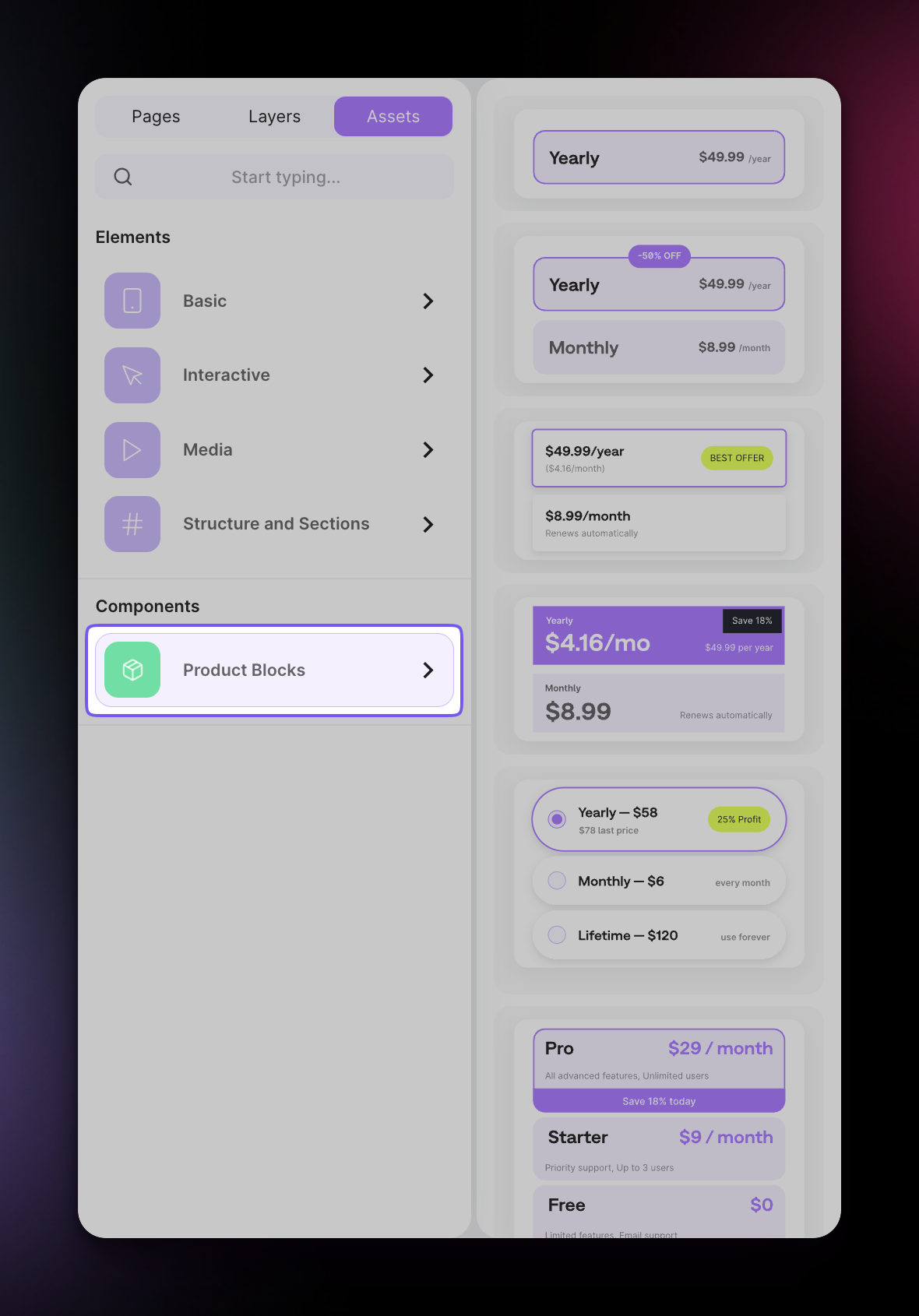 Prebuilt Components are ideal for quickly prototyping screens or getting started with proven layouts. You can always customize every aspect after adding them to your canvas.
#### Product Selection States
Product Block templates include automatic state-based styling:
| State | Description |
| ------------------ | ------------------------------------------------------------- |
| **Default** | Normal appearance when the product is not selected |
| **Select Product** | Highlighted appearance when the user taps/selects the product |
Prebuilt Components are ideal for quickly prototyping screens or getting started with proven layouts. You can always customize every aspect after adding them to your canvas.
#### Product Selection States
Product Block templates include automatic state-based styling:
| State | Description |
| ------------------ | ------------------------------------------------------------- |
| **Default** | Normal appearance when the product is not selected |
| **Select Product** | Highlighted appearance when the user taps/selects the product |
 State changes are handled automatically when:
* User clicks/taps a product in the live paywall
* You preview the screen in the Builder
**Visual indicators for selected state typically include:**
* Border color change (purple accent)
* Text color emphasis
* Radio/checkbox fill
* Background tint adjustment
You can customize both states in the **Right Panel → States** section when a product container is selected.
***
#### Customization
After adding a prebuilt component, you have full control over every element:
#### Styling
* Colors (background, text, borders)
* Typography (font family, size, weight)
* Spacing (padding, margin, gap)
* Border radius and shadows
#### Content
* Product titles and descriptions
* Price display format
* Badge text and positioning
* Feature list items and icons
#### Behavior
* Linked products (connect to your actual store products)
* Default selected product
* Action on tap (Select Product, Make Purchase)
Remember to link each product container to your actual Qonversion products before publishing. Templates use placeholder product IDs that need to be updated.
***
#### Best Practices
* **Start with a template** that matches your goals, then customize
* **Link products early** — connect to real products before extensive styling
* **Test both states** — preview how default and selected states look together
* **Use badges strategically** — highlight your recommended plan with discount or "Best Value" badges
* **Keep feature lists scannable** — 3–5 features per plan is optimal for mobile
* **Preview on multiple devices** — use the device selector to check iOS, Android, and tablet layouts
#### List of prebuilt components
1. [Product Blocks](product-blocks) - templates for subscription and purchase selection screens.
2. [Social Proof](social-proof) - customer reviews and testimonials to build trust.
3. [Carousels](carousels) - swipeable content layouts for onboarding, galleries, and navigation.
4. [CTA Buttons](cta-buttons) - ready-to-use call-to-action buttons with various styles.
5. [Feature List](feature-list) - feature lists, benefit overviews, and plan comparisons.
6. [Awards](awards) - App Store award badges and recognition displays.
***
[Creating Screens](getting-started)
[Product Blocks](product-blocks)
State changes are handled automatically when:
* User clicks/taps a product in the live paywall
* You preview the screen in the Builder
**Visual indicators for selected state typically include:**
* Border color change (purple accent)
* Text color emphasis
* Radio/checkbox fill
* Background tint adjustment
You can customize both states in the **Right Panel → States** section when a product container is selected.
***
#### Customization
After adding a prebuilt component, you have full control over every element:
#### Styling
* Colors (background, text, borders)
* Typography (font family, size, weight)
* Spacing (padding, margin, gap)
* Border radius and shadows
#### Content
* Product titles and descriptions
* Price display format
* Badge text and positioning
* Feature list items and icons
#### Behavior
* Linked products (connect to your actual store products)
* Default selected product
* Action on tap (Select Product, Make Purchase)
Remember to link each product container to your actual Qonversion products before publishing. Templates use placeholder product IDs that need to be updated.
***
#### Best Practices
* **Start with a template** that matches your goals, then customize
* **Link products early** — connect to real products before extensive styling
* **Test both states** — preview how default and selected states look together
* **Use badges strategically** — highlight your recommended plan with discount or "Best Value" badges
* **Keep feature lists scannable** — 3–5 features per plan is optimal for mobile
* **Preview on multiple devices** — use the device selector to check iOS, Android, and tablet layouts
#### List of prebuilt components
1. [Product Blocks](product-blocks) - templates for subscription and purchase selection screens.
2. [Social Proof](social-proof) - customer reviews and testimonials to build trust.
3. [Carousels](carousels) - swipeable content layouts for onboarding, galleries, and navigation.
4. [CTA Buttons](cta-buttons) - ready-to-use call-to-action buttons with various styles.
5. [Feature List](feature-list) - feature lists, benefit overviews, and plan comparisons.
6. [Awards](awards) - App Store award badges and recognition displays.
***
[Creating Screens](getting-started)
[Product Blocks](product-blocks)